
Designing Simplicity:
A User-Friendly Control Panel for a High-Tech Pavilion
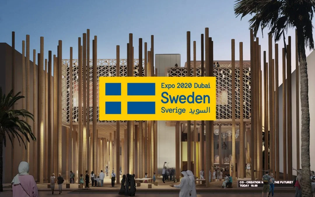
EXPO2020 Dubai / Swedish Pavilion
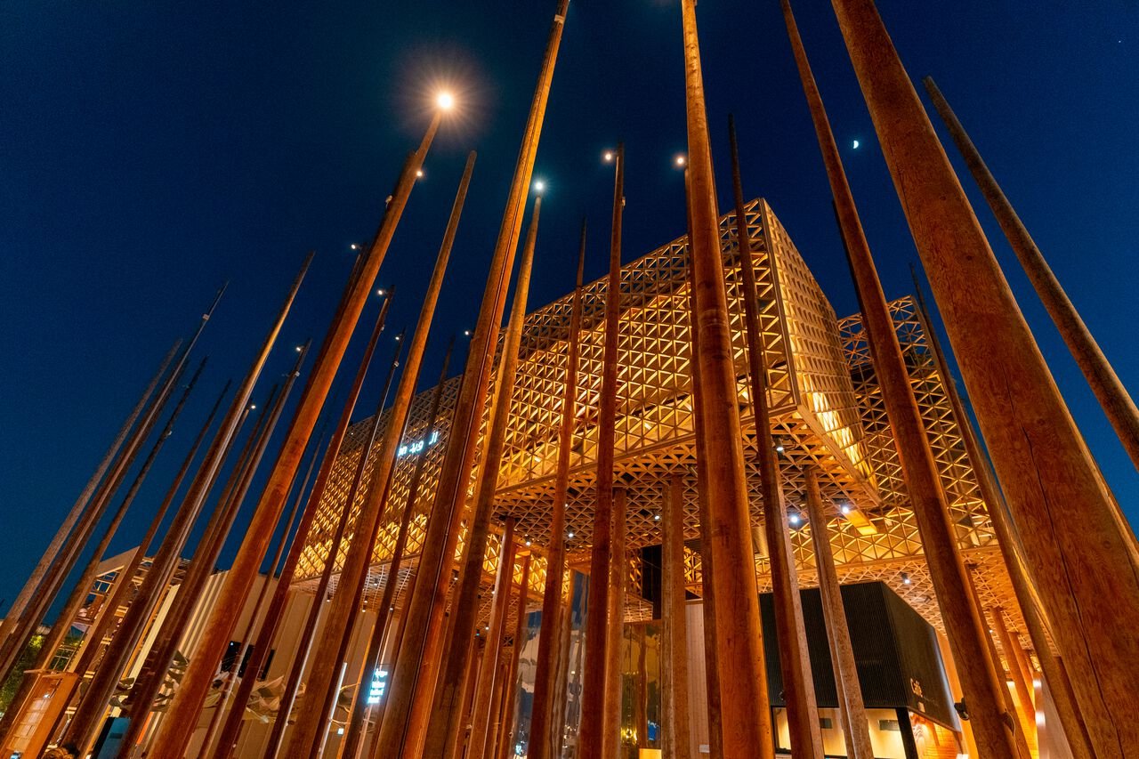
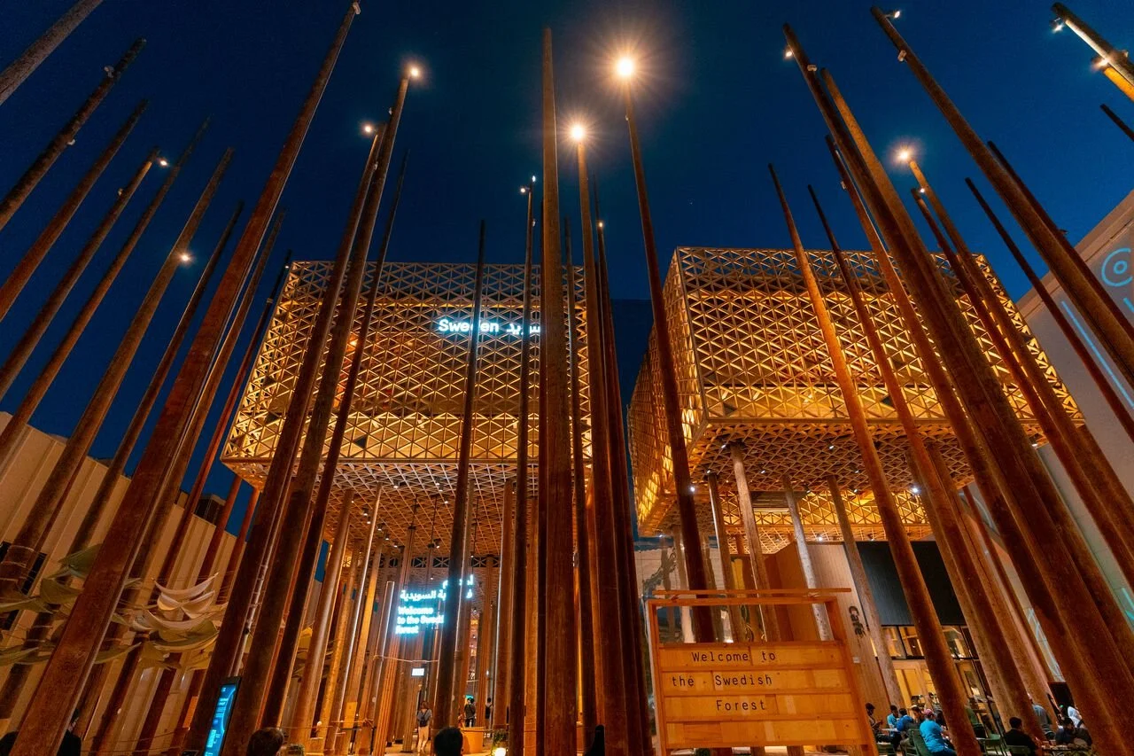
The Swedish Pavilion at EXPO 2020 Dubai was Sweden's most visible international showcase in years — a six-month presentation of Swedish innovation visited by thousands of people from across the globe. Behind that experience sat a complex network of audiovisual technology that needed to run flawlessly, every day, operated by people who weren't technical specialists.
No interface existed to make that possible. My task was to build it from scratch — a control system that anyone could pick up and use with confidence, on their own device, without training or technical knowledge.
The challenge wasn't the technology. It was making it disappear.
This project was carried out during my time as employed at Adapt Event & Expo.
My role
UX & UI design
Where we started
There was no prior system. The Swedish Pavilion had a fully installed network of audiovisual technology — sound, lighting, screens, and interactive elements — but no interface through which a non-technical user could operate it. Everything required specialist knowledge to control, which created an immediate problem: the Pavilion needed to be run daily by staff, visited by thousands of international guests, and used as a venue for high-stakes meetings and events — none of whom could be expected to understand the underlying technology.
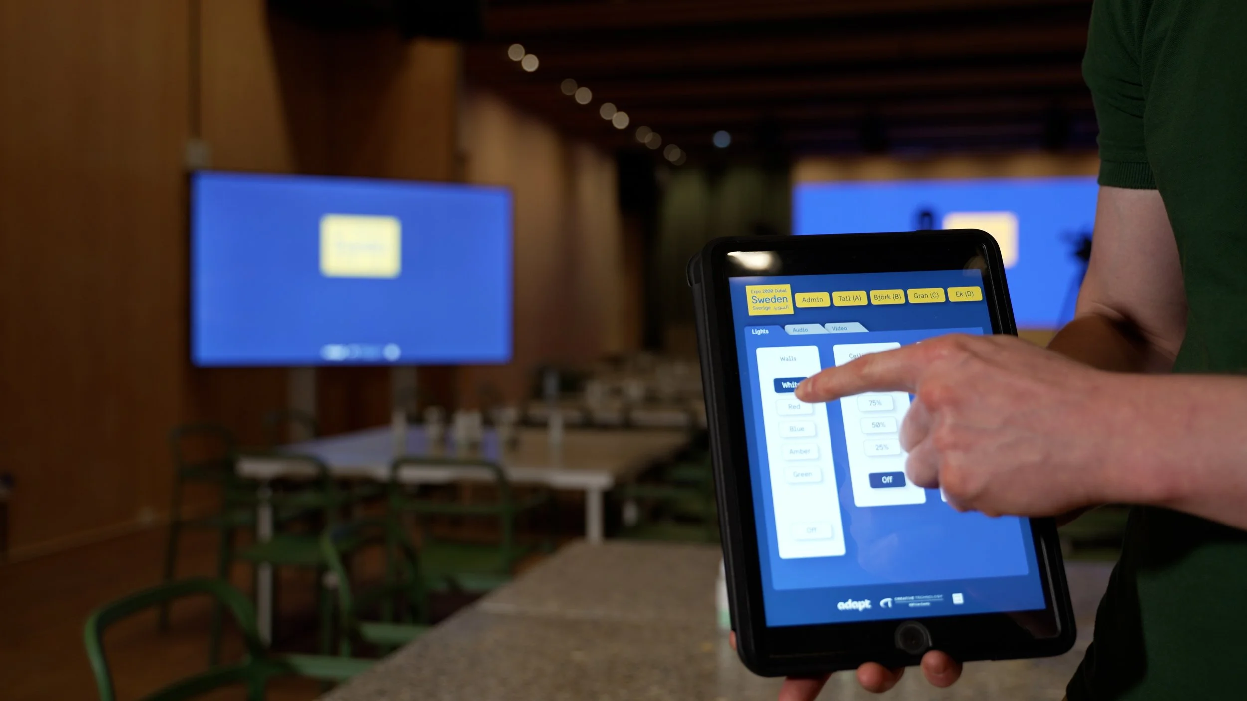
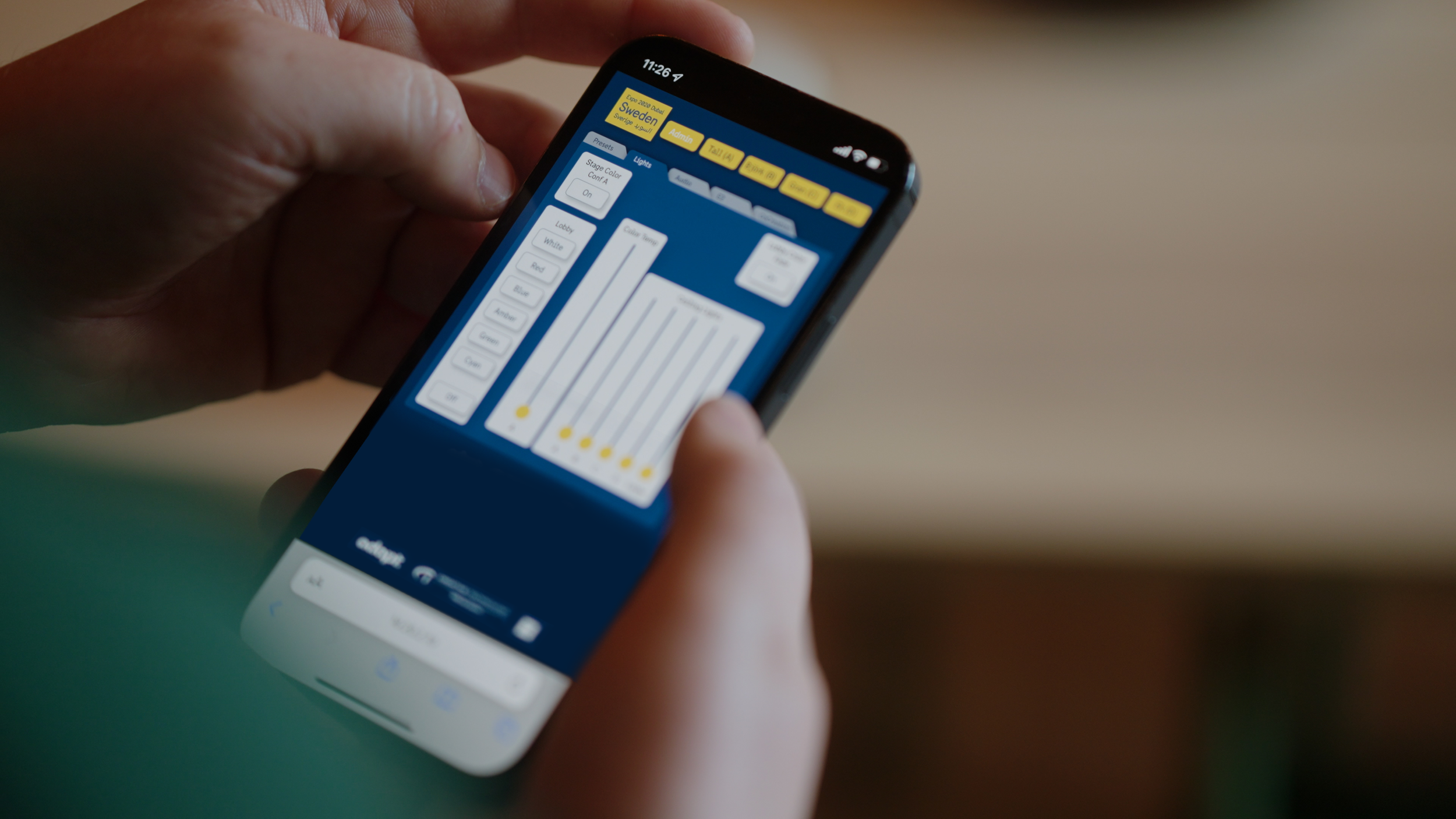
The brief was to build that missing layer from scratch. Using a system called BLOCKS as the development foundation, my job was to design the full user experience and interface — grouping all audiovisual functionalities into a logical structure, then visualising that into a control panel that could be operated from any smartphone or handheld device, by anyone, without prior knowledge or technical training.
"The brief was to build that missing layer from scratch — a control panel that could be operated from any smartphone or handheld device, by anyone, without prior knowledge or technical training."
Research & user groups
One of the defining complexities of this project was that the panel needed to serve two fundamentally different types of users — simultaneously, through the same interface.
The general public
The first group was pavilion visitors who might want to interact with the space, adjust lighting, choose audio, or run their own visuals on screen. For them, the experience needed to be effortless and intuitive — the kind of interface you pick up and understand within seconds, regardless of language, technical background, or familiarity with AV systems.
The on-site technical team
The second group needed access to extended, more complex functions of the same audiovisual system. Their needs were different and their tolerance for complexity was higher — but they were using the same panel.
The solution
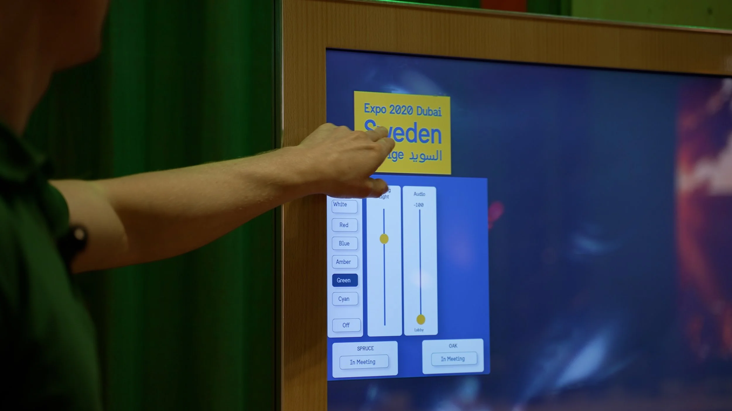
A deliberately layered system: a clean, accessible front layer for general use, with deeper technical functionality available but hidden from casual users. The right information for the right person, without either group having to navigate through what wasn't relevant to them.
Accessibility was not an afterthought in this context — it was a foundational requirement. Designing for public use in an international environment means you genuinely cannot predict who will be holding the device. High contrast for visual clarity was the obvious starting point, but physical interaction proved equally important, as the iteration process would reveal.
Wireframes & iteration
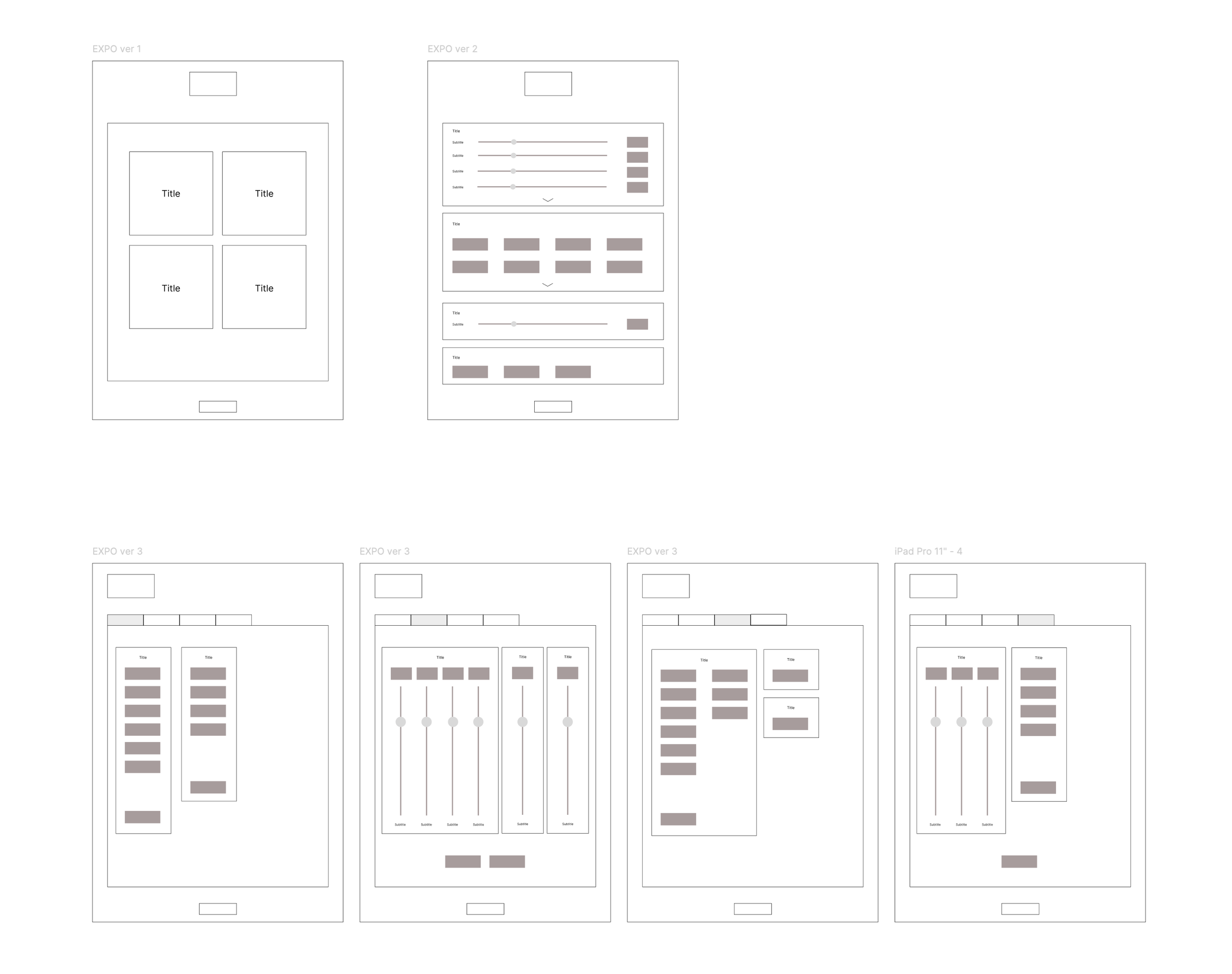
The wireframing phase was where the real design thinking happened — and where several assumptions were tested and overturned.
The first version organised the panel into a menu-based structure, grouping functions by category: Audio, Visuals, Lights, and so on. In principle this was logical, but in practice it created a problem: once a user entered a section, they lost sight of everything else. Navigation became disorienting, and the mental model of where you were in the system broke down quickly.
The second version tried to solve this by making all section content visible at once, with expandable panels for each group. This kept everything in view — but introduced a new problem. The panel now required scrolling, which felt awkward on a handheld device and made it difficult to build a clear sense of structure.
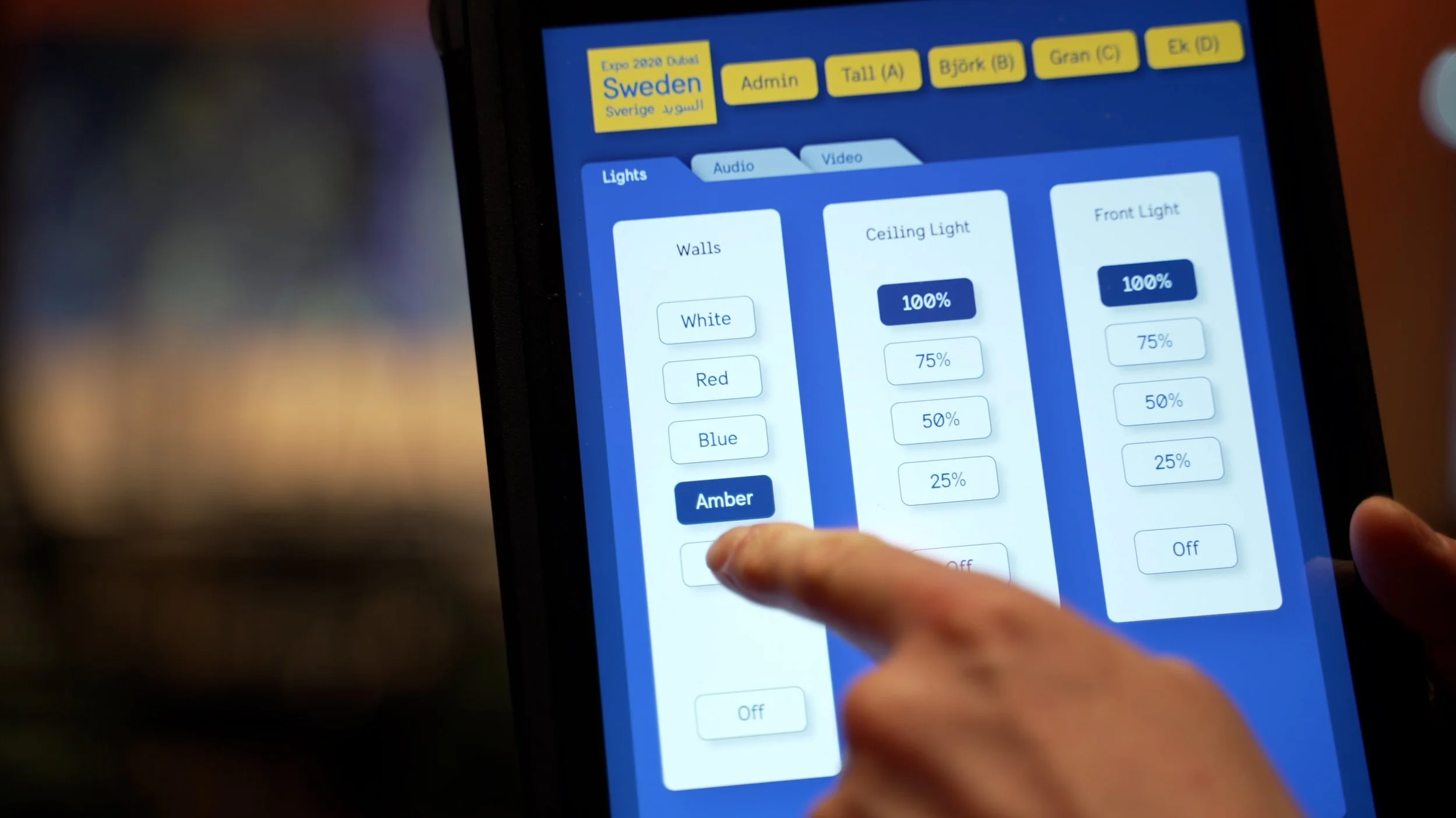
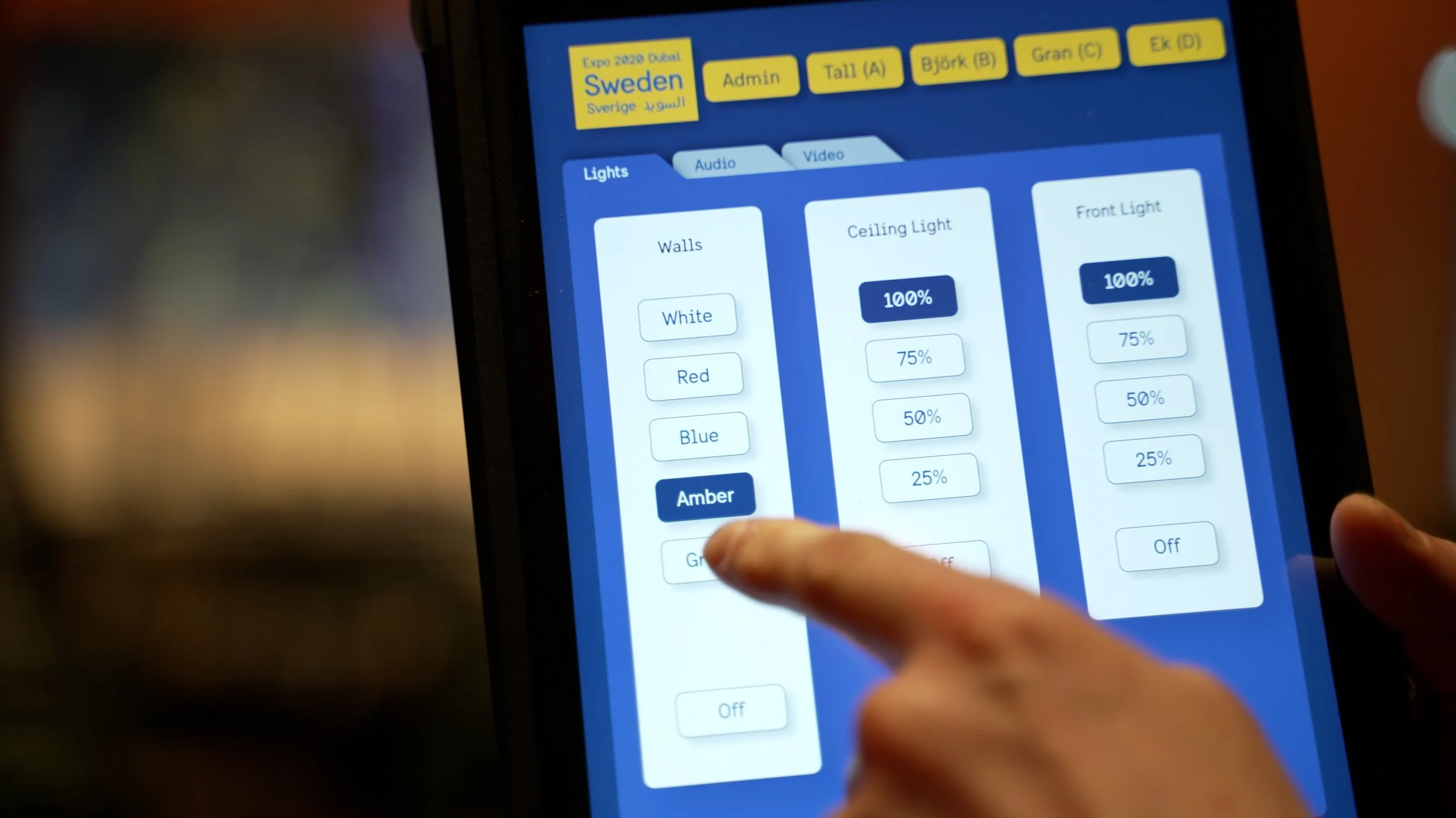
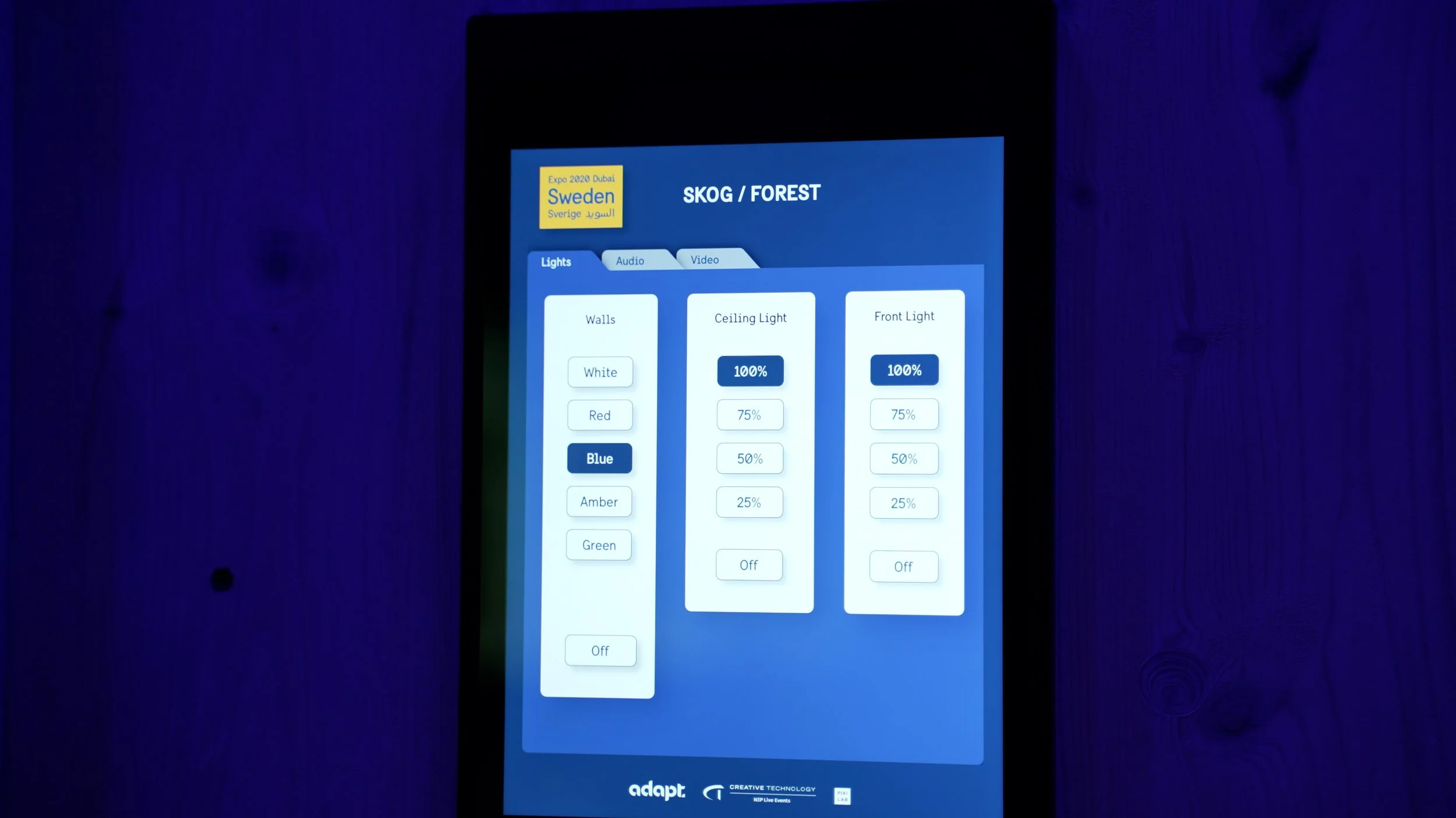
The third version — and the one that worked — introduced tabs across the top of the interface. This kept all functional groups visible and accessible at all times, while focusing the main content area on one section at a time. A user always knew where they were, could navigate anywhere instantly, and never had to scroll to find what they needed.
Tabs also solved a problem we hadn't fully anticipated: physical space. Sliders for audio and lighting controls require enough separation to be operated accurately with a finger. Earlier layouts crammed too many controls into shared space, meaning someone with larger hands could accidentally trigger multiple sliders simultaneously. The tab structure gave each section room to breathe, eliminating that risk entirely.
The lo-fi wireframes from this iteration process are included below — they show the progression from the initial menu structure through to the tab-based solution that was ultimately built.
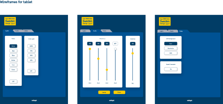
Design system
Because no digital design guidelines existed for this context, I built the UI system from scratch — extending the Swedish Government Offices' visual identity into a fully functional design language for the panel.
The system had to satisfy several demands at once. It needed to carry the brand and feel as considered and unique as the Pavilion itself. It needed to be immediately comprehensible to users with no technical background. And it needed to be detailed enough that developers and on-site technicians — working across different time zones, often at short notice — could implement new requirements independently and consistently without needing to come back to me for every decision.
Accessibility principles shaped the system throughout: high contrast ratios to ensure legibility in varying lighting conditions, generous touch targets to accommodate different hand sizes, and a clear visual hierarchy that communicated the most important controls at a glance.
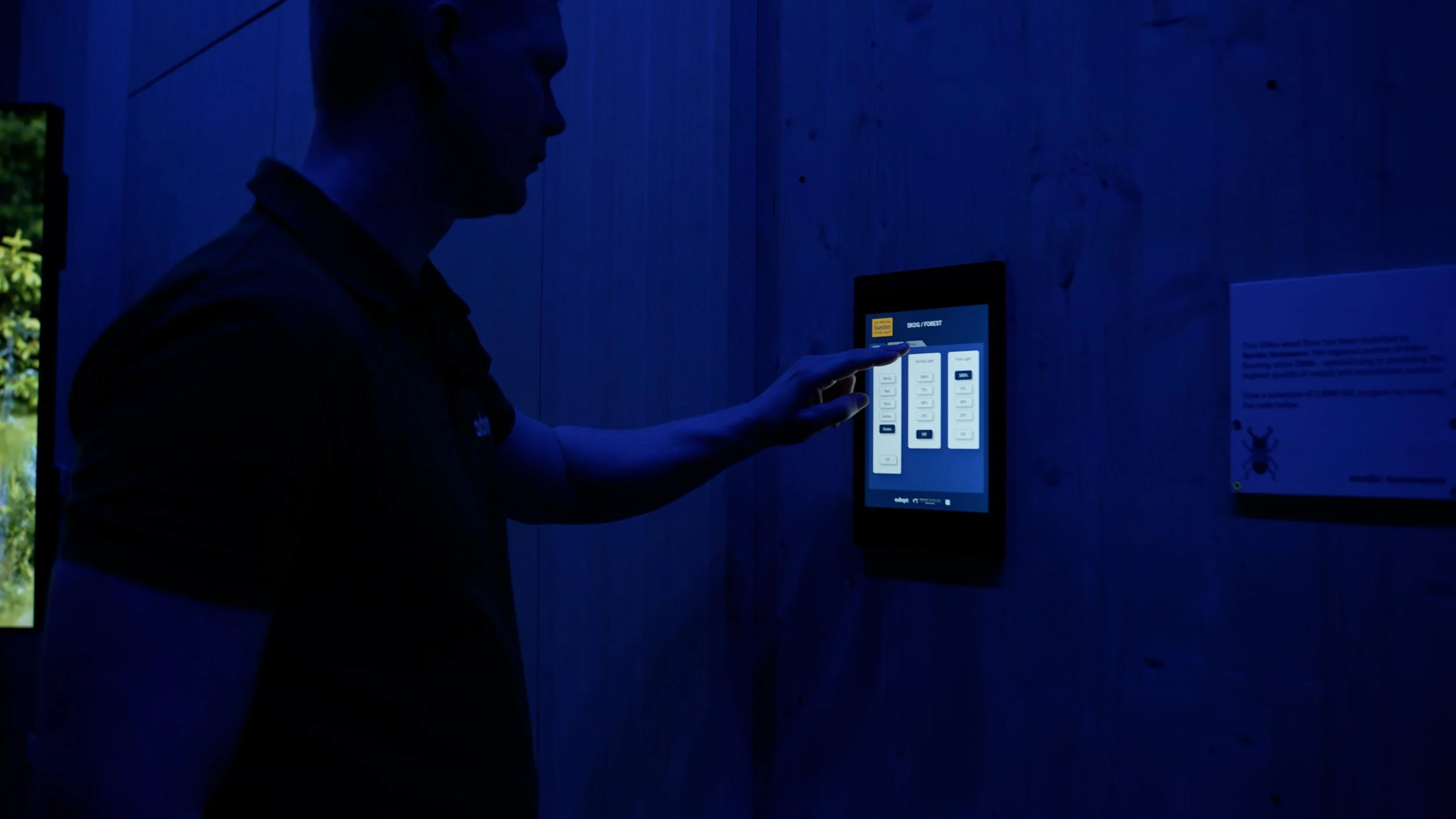
The panel was live and in operation at all times during a six-month event. With high-stakes meetings and presentations taking place in the Pavilion on a daily basis, there was no margin for interface errors or confusion. Resilience was designed in — not considered after the fact.
"Someone with larger hands could accidentally trigger multiple sliders simultaneously. The tab structure gave each section room to breathe — eliminating that risk entirely."
Designing for a live environment
EXPO 2020 ran for six months. The Swedish Pavilion hosted thousands of visitors, numerous official delegations, and high-profile events throughout that entire period. The panel was not a prototype or a pilot — it was operational from day one, in a high-pressure, high-visibility environment with no downtime permitted.
Technical project managers were present on-site throughout, which provided an important safety net. But the Pavilion was large and frequently running multiple events simultaneously across different spaces. The realistic scenario was not "someone is always available to help" — it was "someone might be on the other side of the building." The interface had to be resilient enough that users could solve problems themselves, and clear enough that they rarely encountered one.
Iterations continued throughout the live phase as new requirements emerged and real-world use surfaced details that testing hadn't caught. In many ways the live phase functioned as an extended test period — the highest-stakes usability study possible, with immediate feedback and real consequences.
Project outcome
No formal success metrics were established for this project — something I would advocate for from the outset in future engagements of this scale.
What can be said is this: the panel ran live across the full six-month duration of EXPO 2020, operated daily by non-technical staff in a high-pressure, internationally visible environment. High-stakes meetings and events took place in the Pavilion throughout — and not a single one was compromised by a failure of the control interface. In the absence of formal measurement, that is the most meaningful benchmark available: nothing went wrong that should have gone right.
It was also one of the most instructive projects of my career — one where the feedback loop between design decision and real-world consequence was immediate, and where the value of resilient, accessible, user-centred design was tested under genuinely demanding conditions.