Rewatt / A strategic rebranding & UX/UI design
More Than a Makeover: Rebranding Rewatt from the Inside Out
Rewatt approached me with a challenge that went beyond visual design: their brand no longer reflected the company’s evolving purpose, positioning, or ambition.
The brief was clear—revitalize the brand, but make it meaningful. That meant uncovering the core of Rewatt’s business, understanding their market context, and aligning the new identity with their long-term vision.
Through in-depth discovery, I surfaced communication gaps and reframed the brand’s expression to convey clarity, approachability, and confidence. This rebrand was not about aesthetics alone—it was a strategic reset, designed to support Rewatt’s next phase of growth. How can a brand identity do more than look good—how can it communicate purpose, build trust, and reflect where a company is headed?
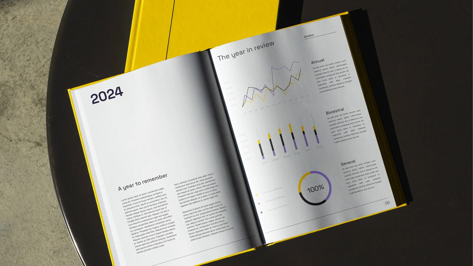
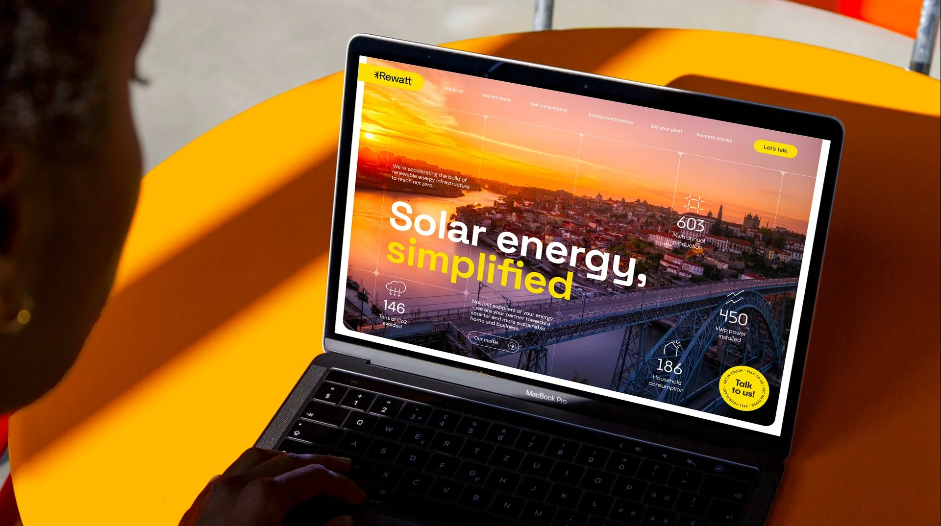
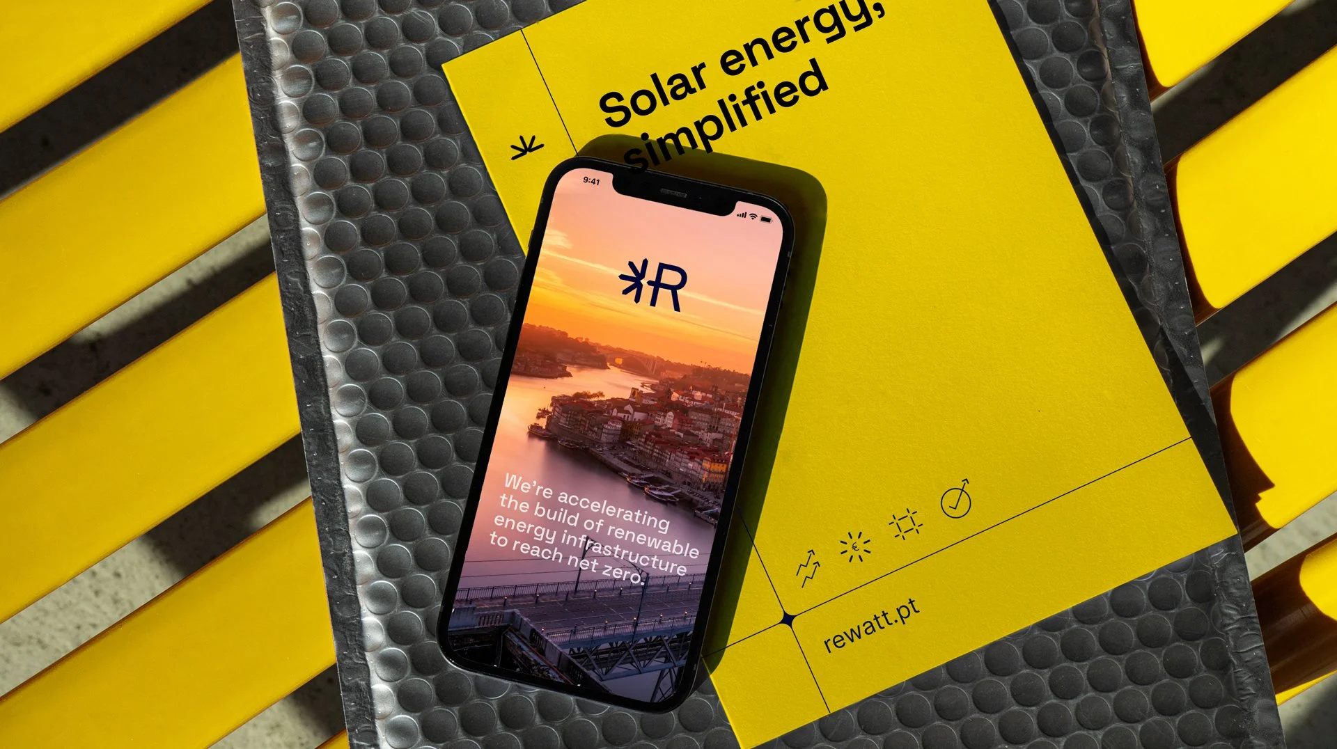
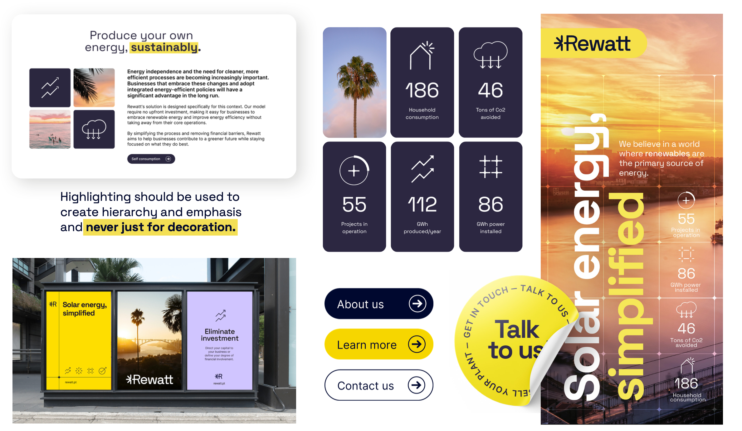
Rewatt wanted all that and a beautiful, yet functional, website to back up the good looks.
This project was carried out during my employment at Smartenergy.
My role
Research & market analysis
Brand design
UX & UI design

Research
As Rewatt aims to stand out within its competitive segment it is important to analyse the key competitors and how they portray themselves - so I could then make informed decisions when positioning the brand.
By identifying a few of their main competitors visual and communicative similarities and differences I could strategically choose where to align and in which areas to stand out - and in that way craft and distinguish Rewatts brand and communication while actively positioning it within the market segment.
How can a brand identity do more than look good—how can it communicate purpose, build trust, and reflect where a company is headed?
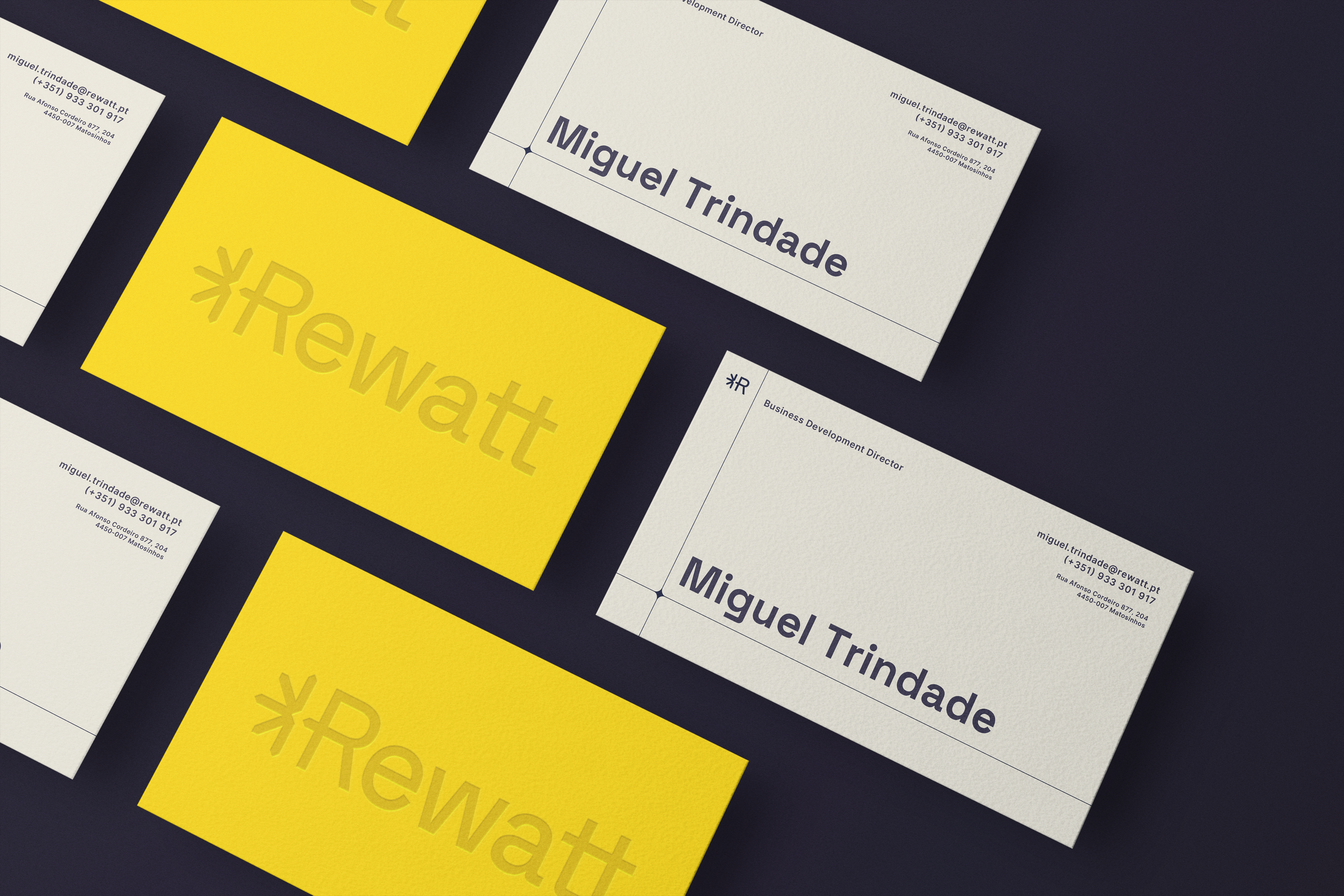
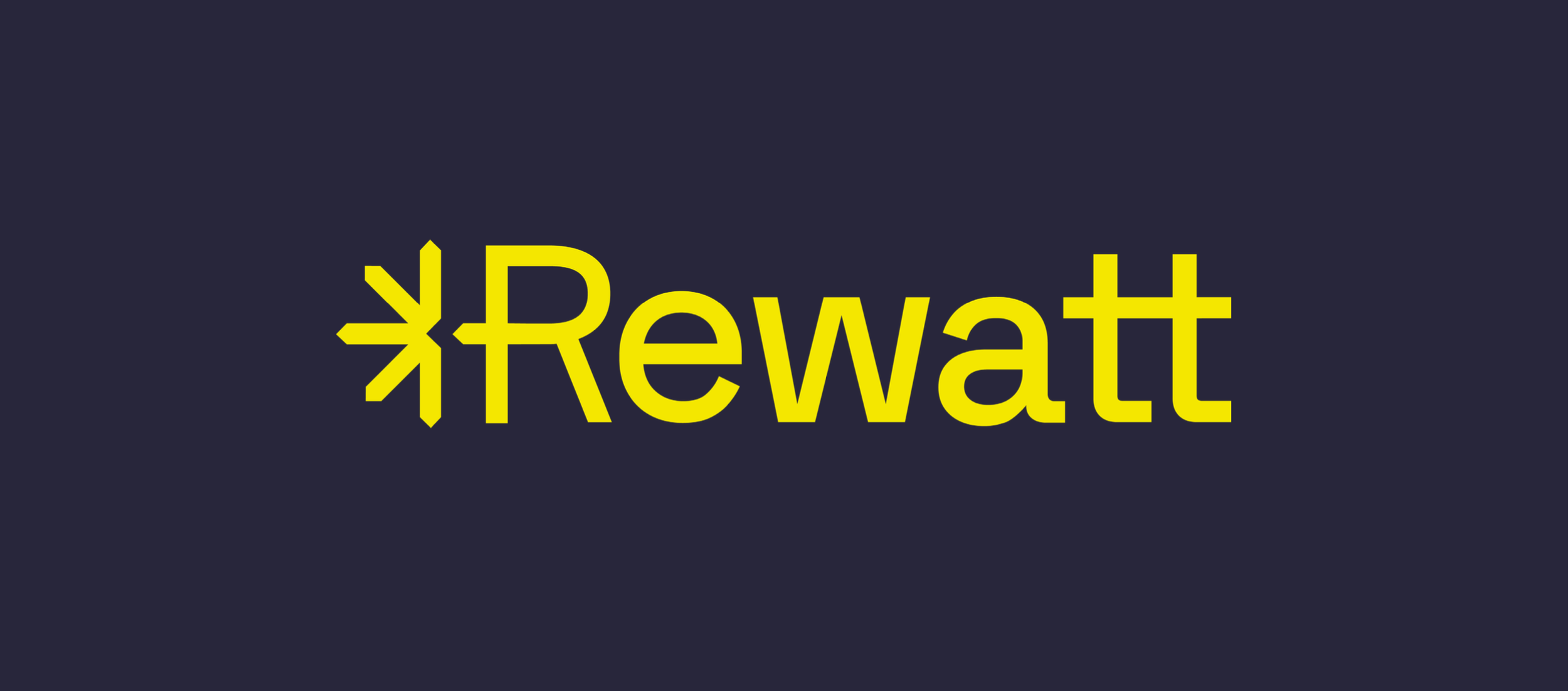
Logotype
Incorporating a simplified sun in the text mark logo symbolizes the commitment to harnessing solar energy’s power. The logo captures the essence of their mission – a bright, forward-thinking approach to a future run with solar energy.
The clean lines and minimalistic design of the sun represent simplicity and environmental consciousness, reflecting the brand’s dedication to providing efficient and sustainable solutions. This will make it easy to remember and put Rewatt top of mind within the solar energy market.
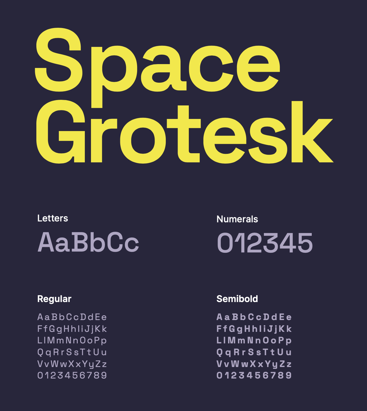
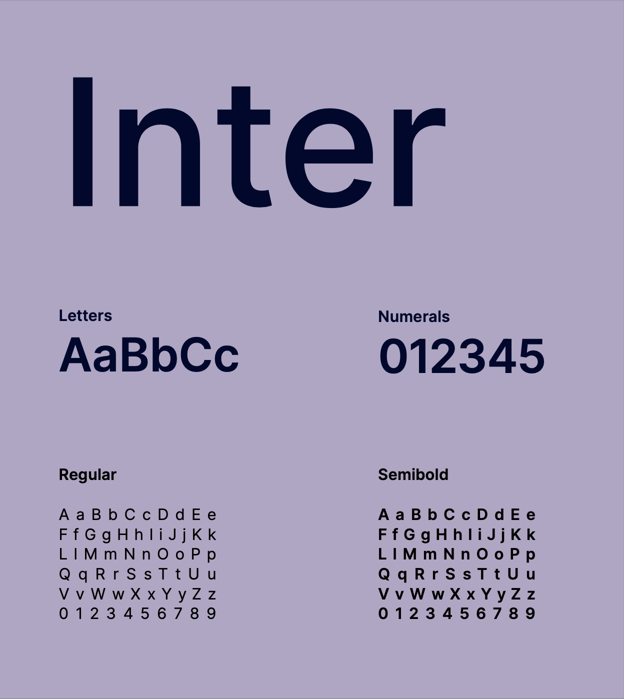
Typefaces
The choice of a powerful geometric sans-serif font complements the logo’s clean lines and signifies a seamless blend of modernity and technological advancement.
With its bold, dynamic personality, the font reinforces our commitment to innovation in the renewable energy sector, conveying a forward-thinking image that resonates with the brand’s ethos.
To pair with Space Grotesk we introduce a font called Inter, which spans countless languages, works on all types of screens and thus is perfect for body text. The sans serif font allow for optimal legibility across all platforms, especially where it is needed most: in digital media and small sizes. Inter’s simplicity, clarity and rounded forms make it the perfect functional typeface.
Unless we’re being expressive and bold, we use Inter to make sure we communicate easily with everyone, especially in extensive texts.
Imagery
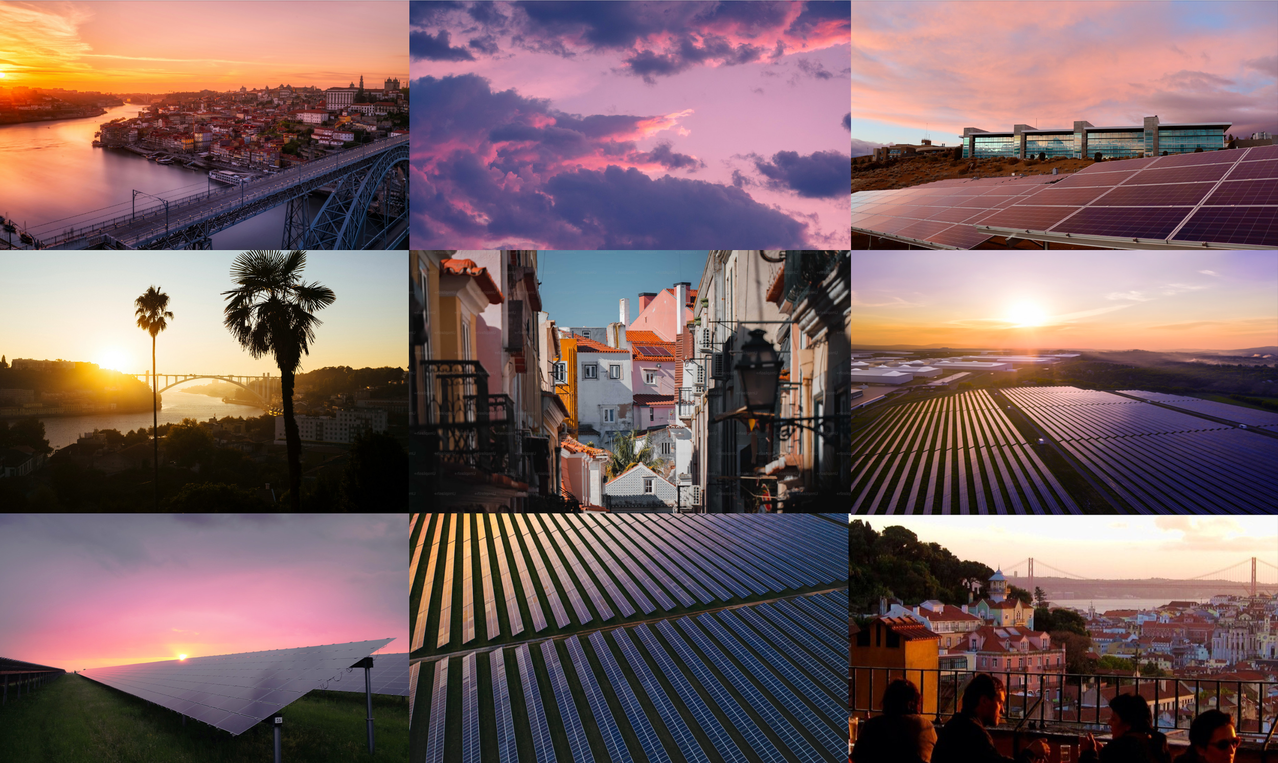
A mix of photos of solar panels and everyday portuguese life, in natural situations at dawn and dusk, where their customers can easily identify make up the foundation of the imagery concept.
Combined with carefully curated imagery of solar panels basking in the soft morning light and the enchanting palette of the sky during dawn and dusk collectively infuse the visual identity with extraordinary depth and an intriguing color palette. This distinctive blend not only sets them apart from competitors but also defines Rewatt as a unique force in the solar energy industry - down to earth and identifying with the portuguese people.
The carefully selected images create the canvas for brand communication. Quieter areas of the image is used for copy and brand messages. The content, tone of voice and imagery is inclusive and relevant to individuals, not distinguising between corporate and private actors.
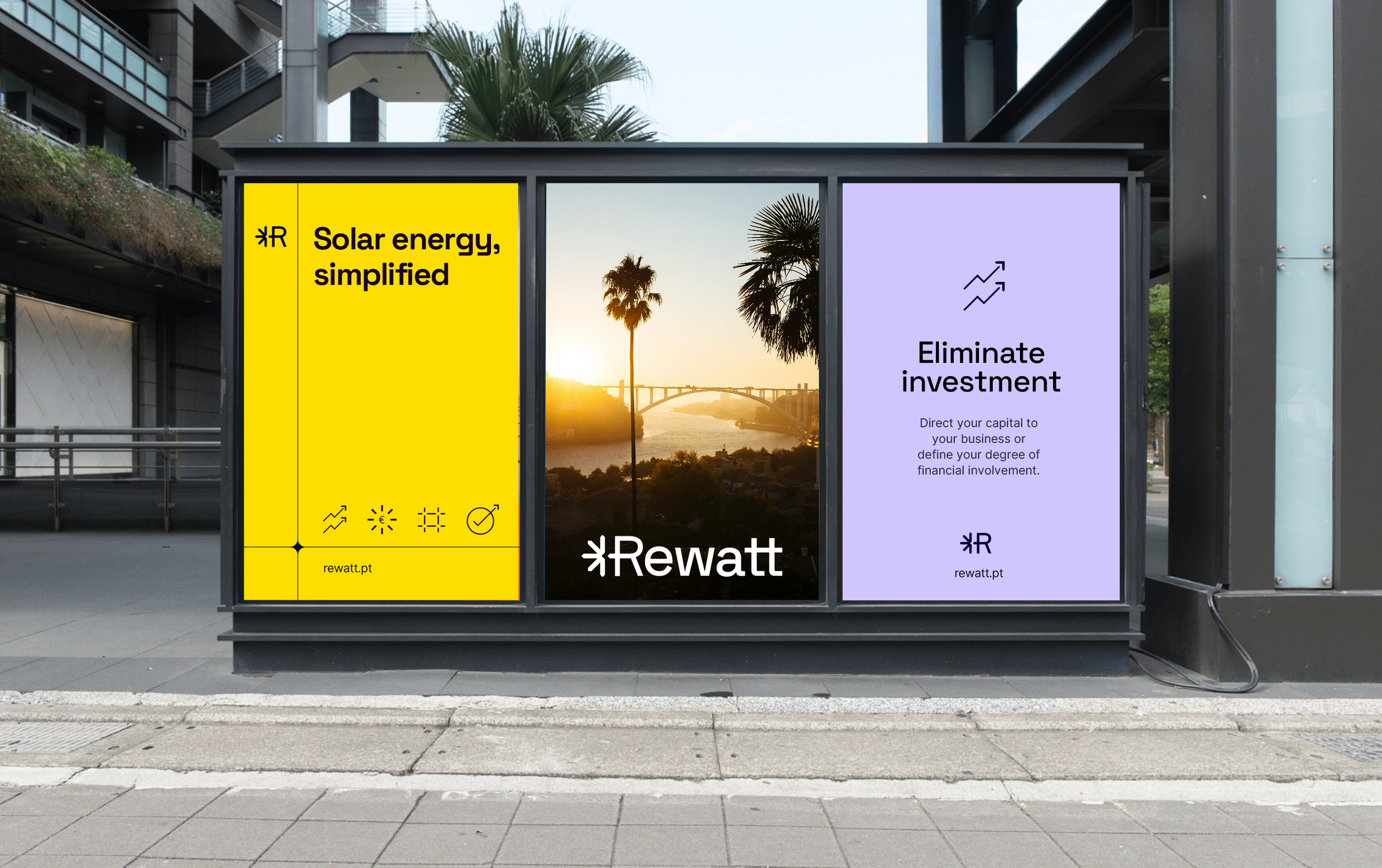
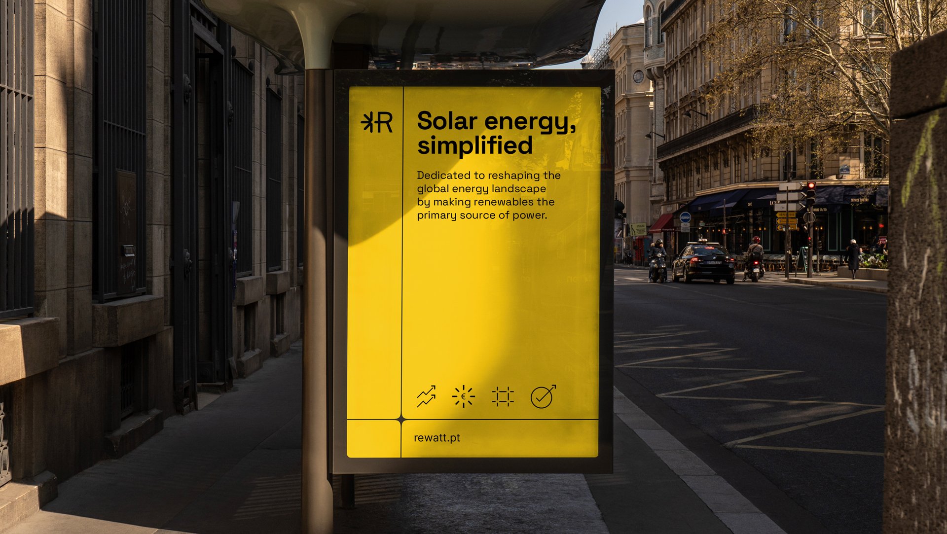
Colors
Bright yellow and natural purple were selected as brand colors to represent the sun and to pair well with the selected imagery concept.
The sunshine yellow is used to highlight and emphasize key wordings in messaging and signify call to action points in digital touchpoints. The color combination ensures high contrast and accessibility in all communication.
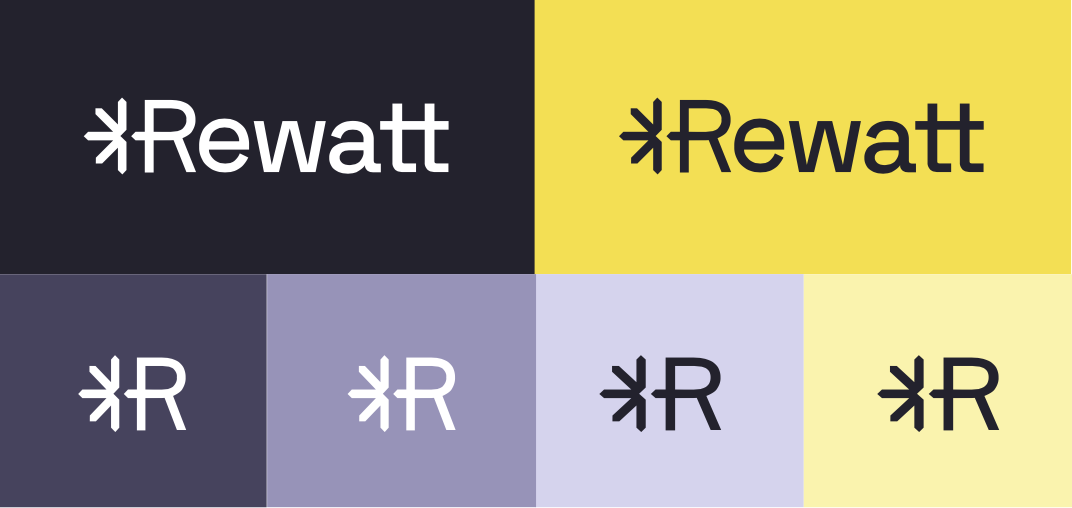
Symbols & graphics
The graphics such as the symbol and icons follows in the same style as the logo. Each one individually crafted to fit the communication needs and brand style.
We communicate their brand USPs simply with the use of these graphics in symbiosis and ensure high contrast and accessibility with the chosen brand colors through all touch points. The logo symbol is used for recognition where the logo in full is not needed, making the logo fully versatile and adaptable to any setting.
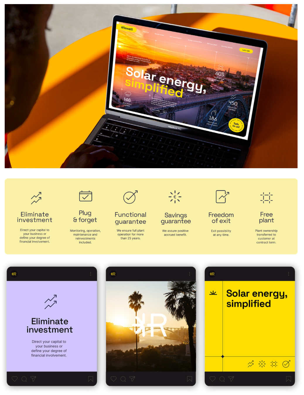
UX & UI design
In digital media I wanted to focus on brand distinguishment and relevant information with clear CTAs for the target audience - not to overpower with unneccessary information and make navigation on the website easy.
I analyzed their current website pin-pointing and highlighting confusing sections and rewriting content to simplify Rewatts’ offer and language so that it would be easier to comprehend and navigate. Adding actions and mapping out a clear path toward final decisions regarding a purchase.
I followed up by creating a UI style guide to ensure consistency through all their digital touch points. To ease design work flow I worked in Figma for the website design, enabling an easy handover to developers and utilising tools such as libraries and variants for a speedy design process and consistency across the website.
Physical touchpoints
For their merchandise and physical touchpoints, envision items that seamlessly integrate into everyday life, reflecting the harmony of solar energy in our daily existence.
Branded practical items like reusable bags, solar-powered gadgets, or eco-friendly wearables, would be considered, creating a tangible connection to our brand’s sustainable ethos.
Project outcome & learnings
A summary of a few of the common strategic choices that I made in all of these three design concepts to set Rewatt apart, ensuring a unique and memorable brand.
Tone of voice
As competitors tend towards a safe, informative, and corporate tone my pragmatic decision in this rebranding has been to infuse our communication with a more engaging tone that strategically positions us as both accessible and credible. This approach stands out in a landscape where predictability and more conservative decisions often prevails.
Imagery
The strategic choice to deviate from the standard energy infrastructure visuals to more unexpected conceptual imagery not only sets us apart but helps bring our narrative and brand story to life and provides a fresh and engaging perspective, simultaneosly distinguishing us from the industry standard.
Colors
In a sea of competitors favoring common blues and greens, the strategic inclusion of other tones in our palette sets Rewatt apart. This deliberate departure ensures our branding stands out prominently, offering a fresh and distinct visual identity in a saturated market.
Font
While competitors adhere to a safe industry standard sans-serif font, our differentiation lies in exclusive use. Reflecting a commitment to modernity, simplicity, and readability, these choices positions our communication as distinct in a market where conformity is the norm.
Visit rewatt.pt to check out their online presence.