
SAAB / Redesign of Experience Center Control Panels
Redesigning Control at The Edge: Simplifying Tech for a High-Stakes Showroom
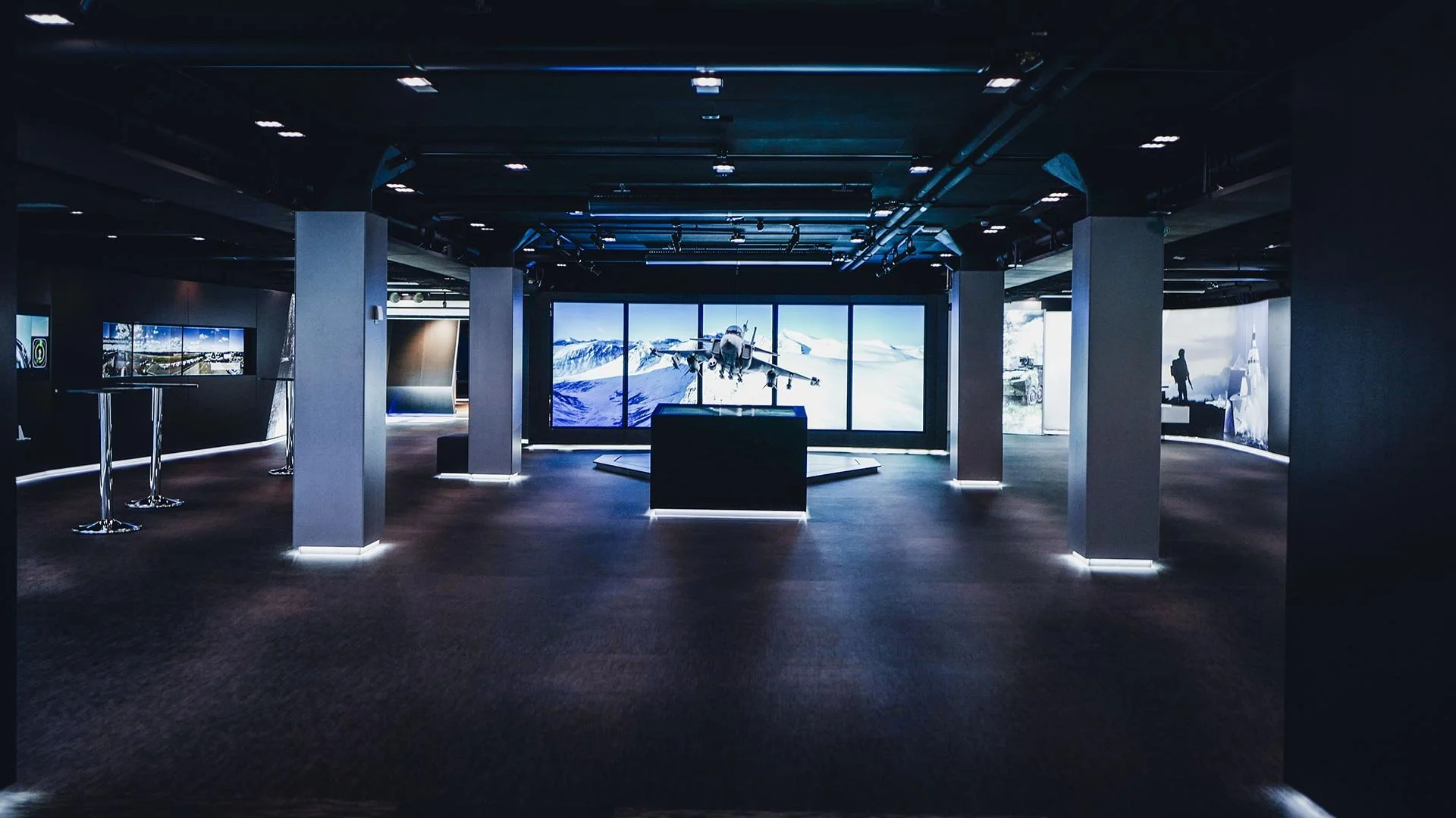
As part of SAAB’s move to its new Stockholm headquarters, an entire floor was dedicated to The Edge – SAAB Visitor & Experience Center—a high-tech, immersive space used to present the company’s innovations and host events. Me and my team was responsible for designing and implementing the original interactive technical installation, including sound, lighting, image, and IT systems.
After several months of use, I was tasked to rethink and redesign the existing control panels, which had become a usability bottleneck. The challenge was to simplify and enhance the interface, ensuring that staff could manage the complex environment confidently, efficiently, and without technical training—supporting the premium experience SAAB intended for every visitor.
This project was carried out during my time as employed at Adapt Event & Expo.
My role
UX & UI design
Goals
Understand how the control panels are used today.
Identify the user pain-points and frustrations in the existing flow.
Develop solutions to enhance the user experience.
Extend SAABs existing design system to better comply with our product.
Solution
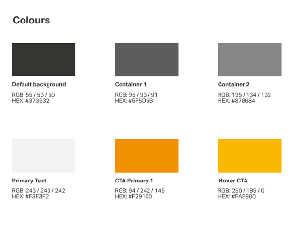
Using SAABs existing visual guidelines for typeface, colors and hierarchy to create the fundament for a cohesive concept we extended their design system to better comply with the functions needed to be able to control the multiple technical assets.
Usability testing #1
We carried out a initial usability tests on the existing panels to find out how the users interacted with them and what frustrations they experienced.
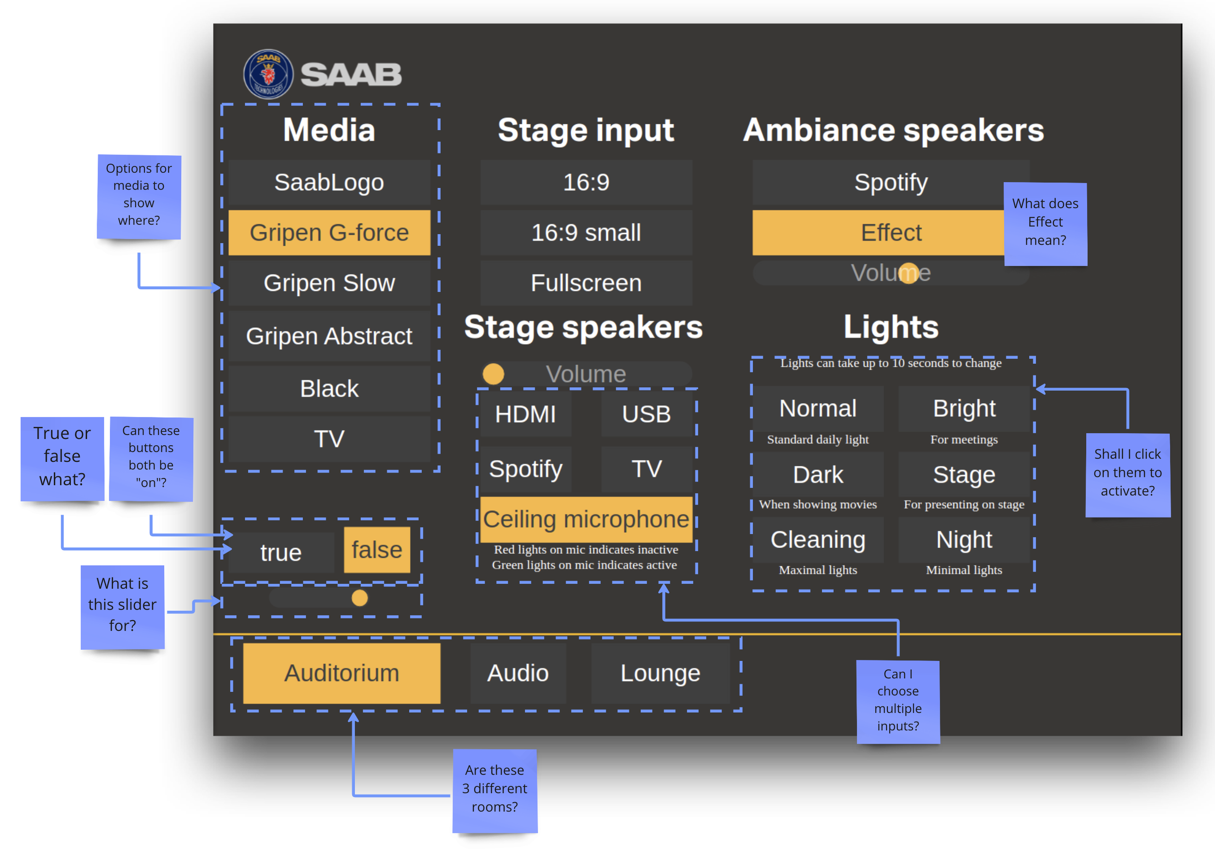
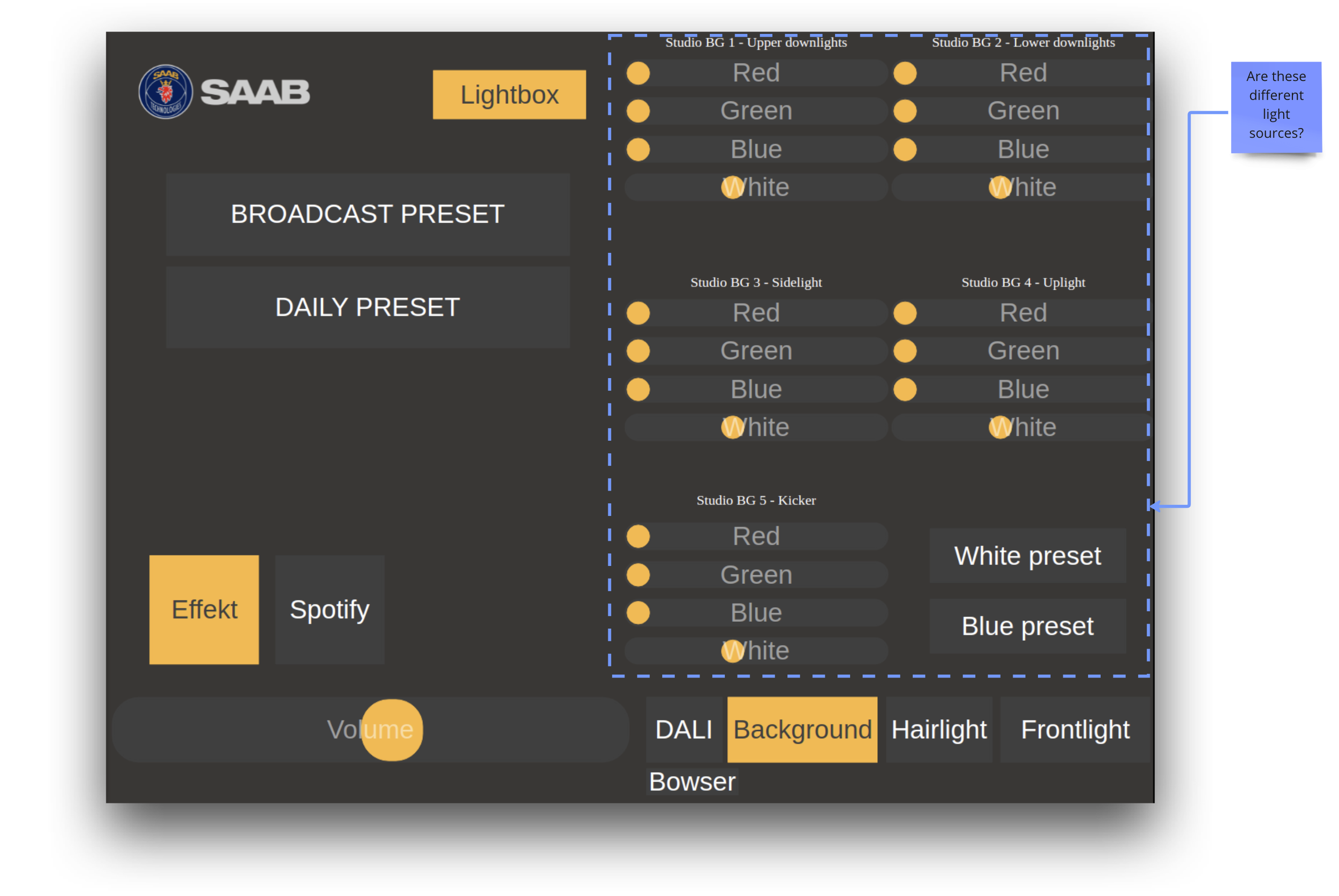
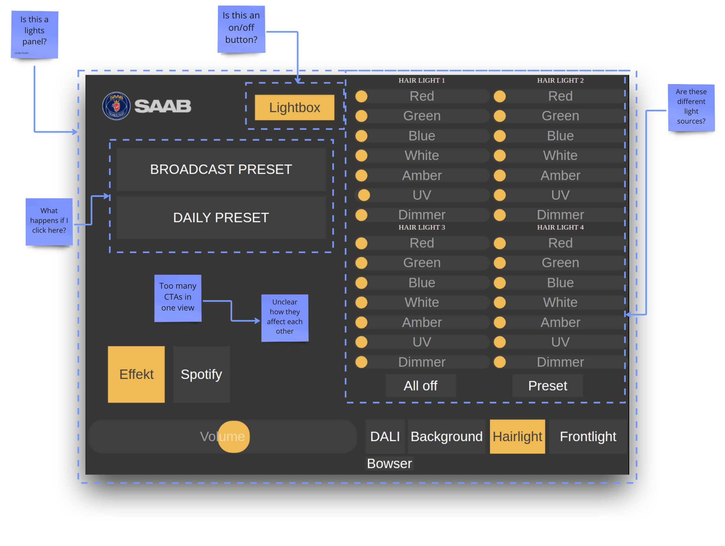
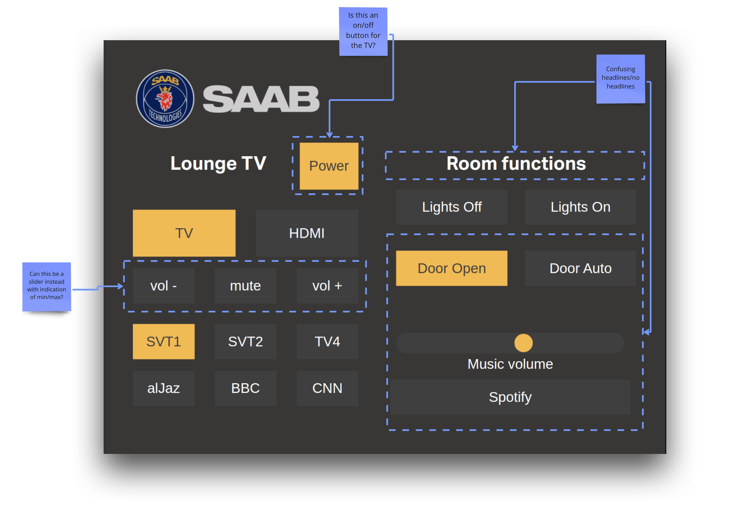
Identified issues
01
The existing layout is messy and inconsistent
02
The design is too crammed
03
Hard to understand and navigate
04
Confusing layout
05
Non existing visual hierarchy leads to mental overload
06
Many competing messages
Gained insights
01
We need to create consistency with the design system
02
More whitespace is needed
03
Clarify CTAs by clearer affordances
04
Use a safer conceptual model
05
One CTA per area/screen view
06
Define actions and group them together
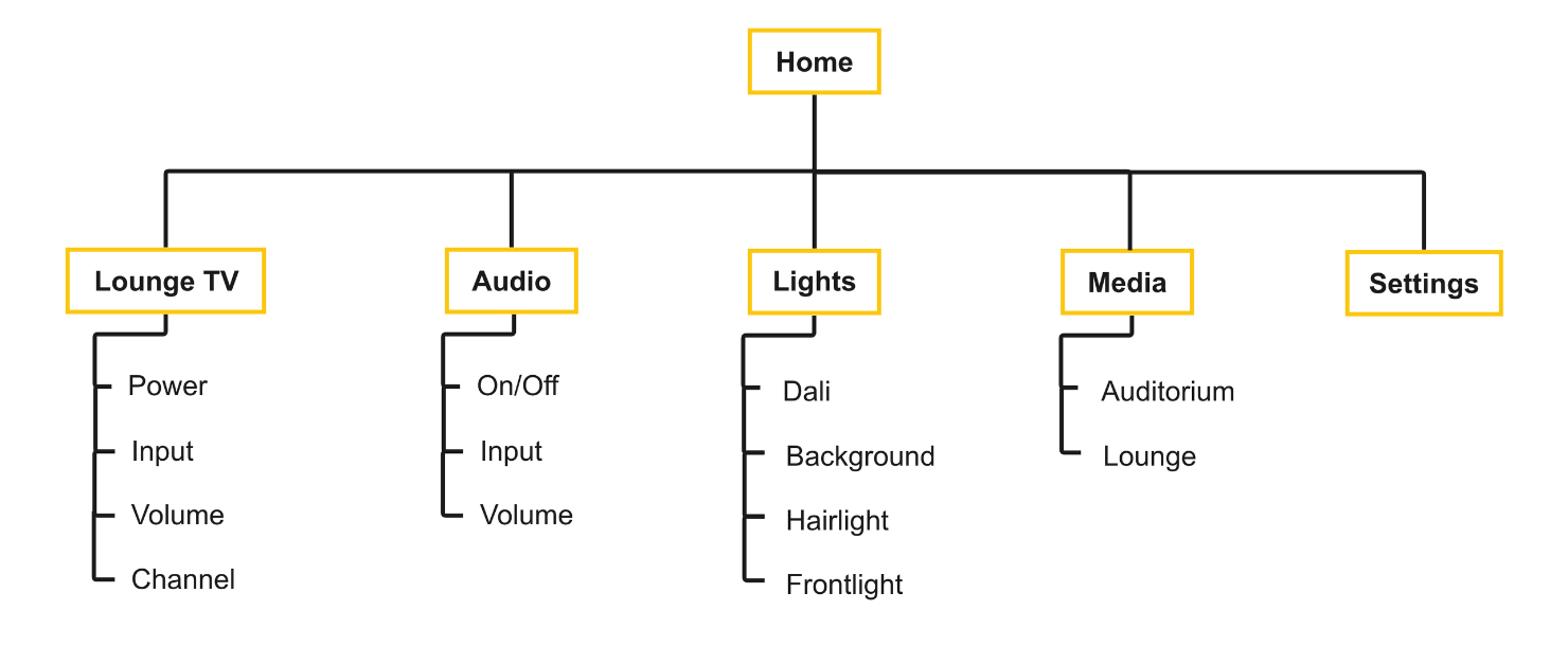
User flow
Based on these issues and insights we started to group actions together and to map out a new user flow that would be more easily interpreted.
Design system
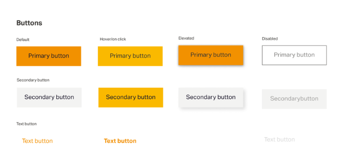
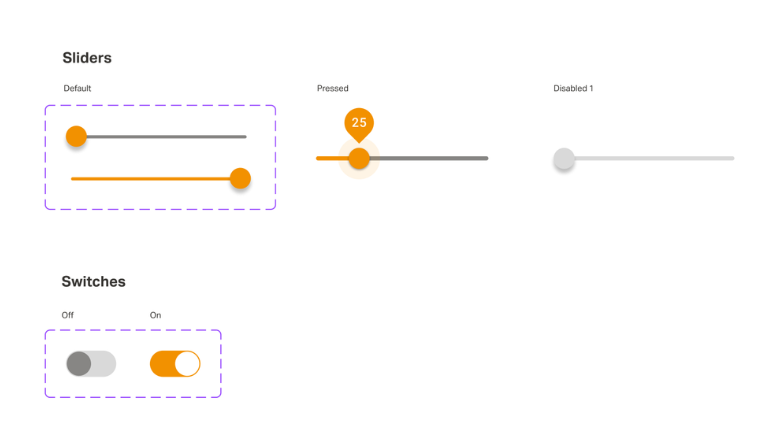
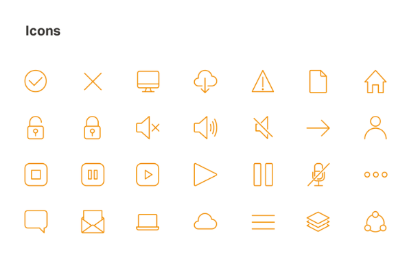
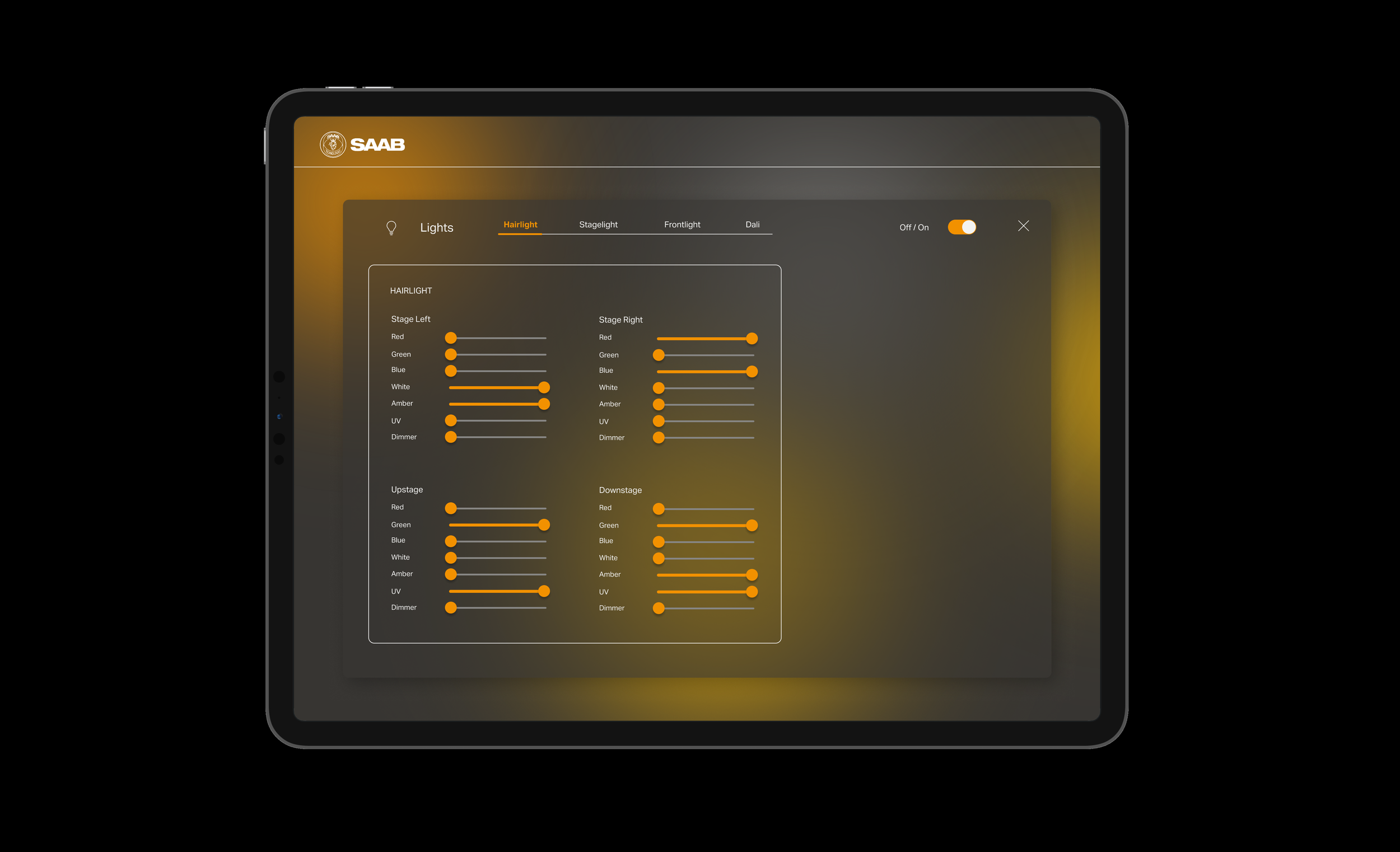
I started out from SAAB's existing design system and extended it with additional components needed for the panels, such as switches, sliders and checkboxes.
Delivered contributions to the style guide to ensure consistency with brand direction and a cohesive feel across all platforms.
The aim was to have options to be able to create varied solutions and a well-balanced, system-wide user experience – which could be used in any digital environment as we move further with upcoming digital products for the client.
Sketches & lo-fi wireframes
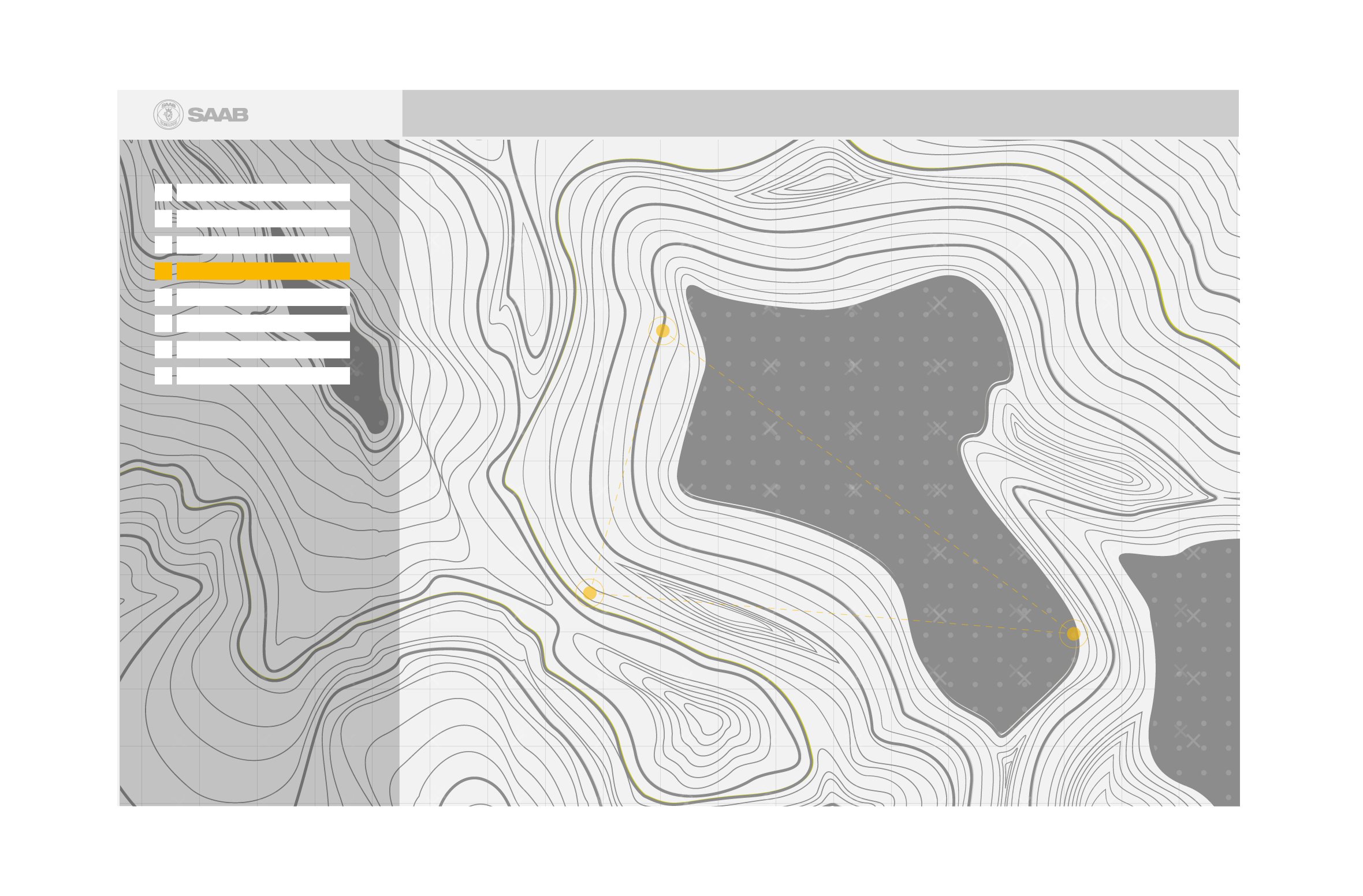
In order to structure content and functions clearly, I wanted the layout to be able to be subdivided vertically and horizontally into blocks. It is important for each block to have a function. Text, images, buttons and icons should contribute to the clarity of the overall impression.
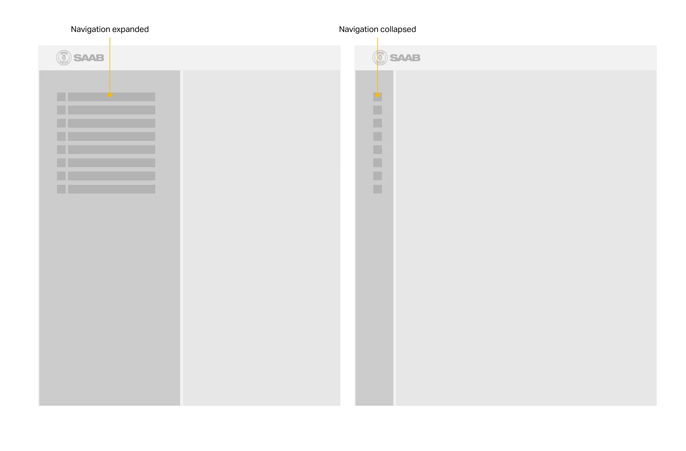
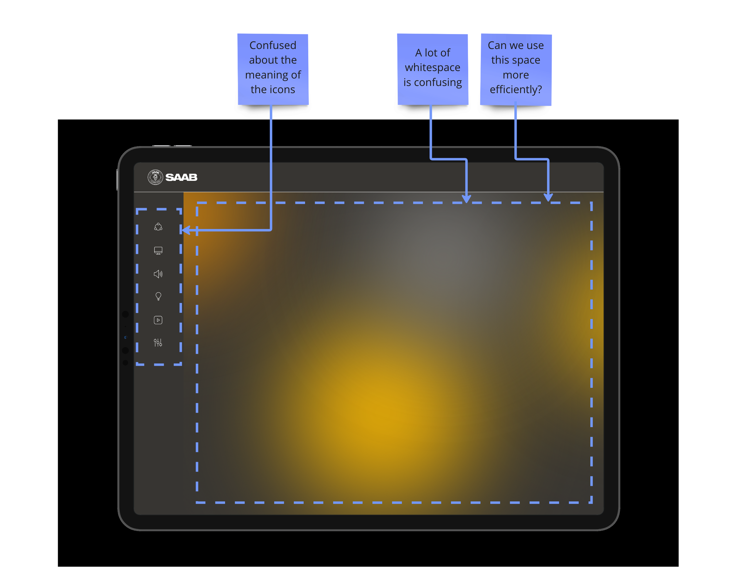
In the initial wireframes I chose left navigation as the panels will be used on iPads in horizontal mode. When not activated the menu can be collapsed into a bar so that more content can be displayed.
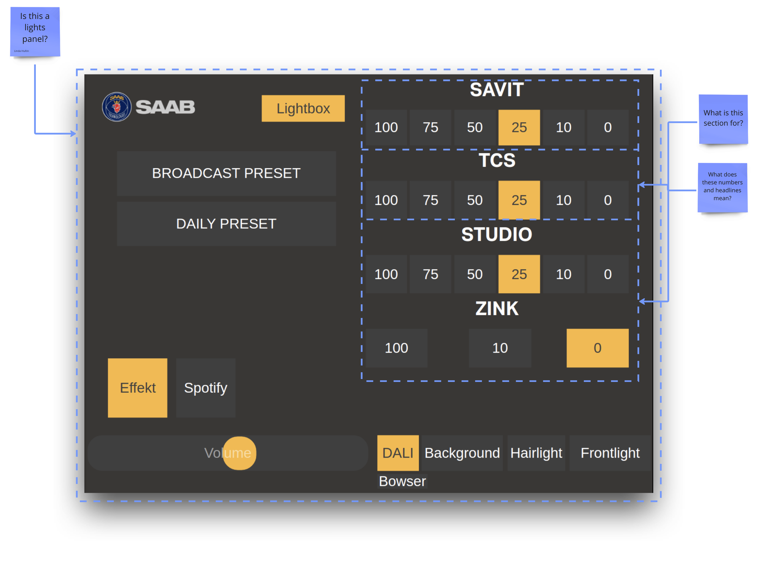
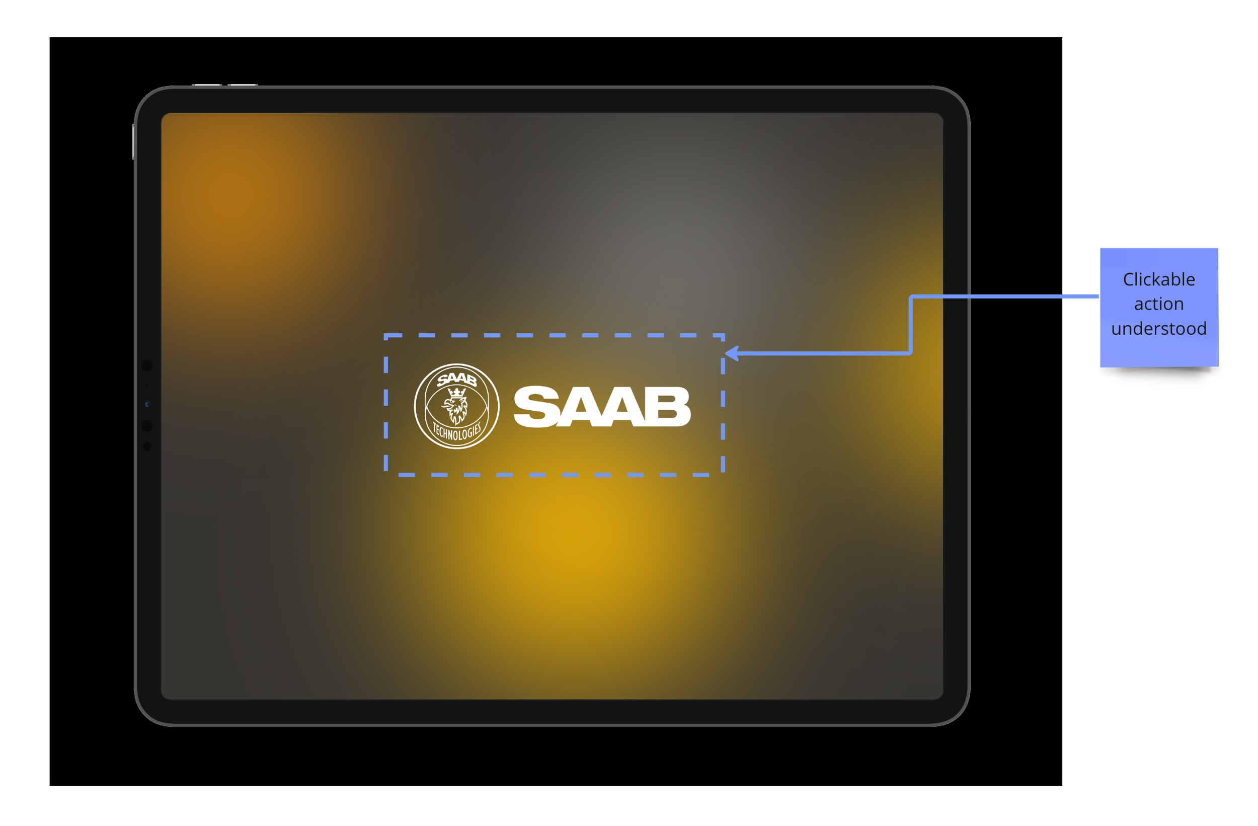
Prototype #1
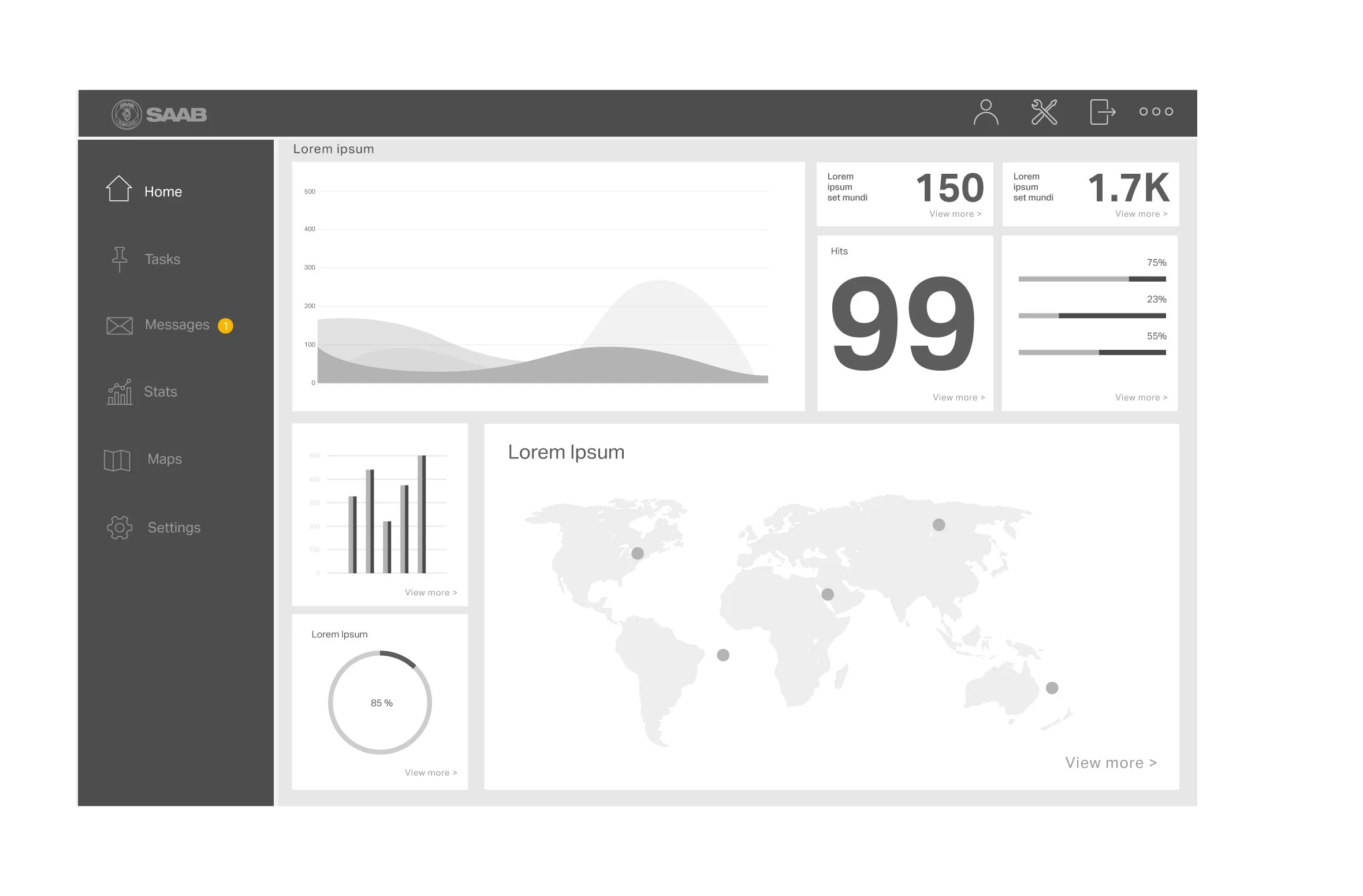
After initial decisions on the design system and layout I started making the first draft of the prototype in Figma to be able to carry out further user testing.
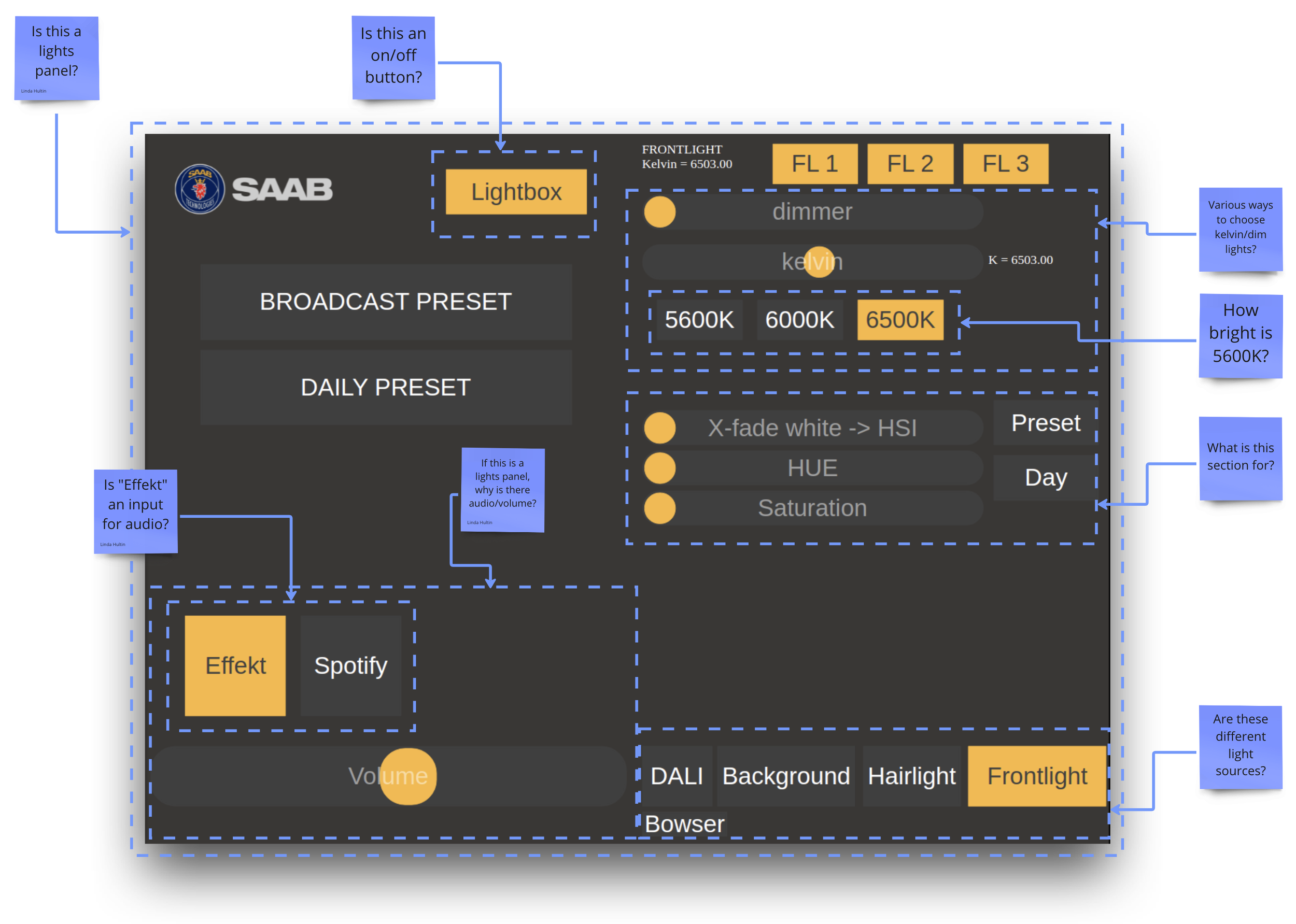
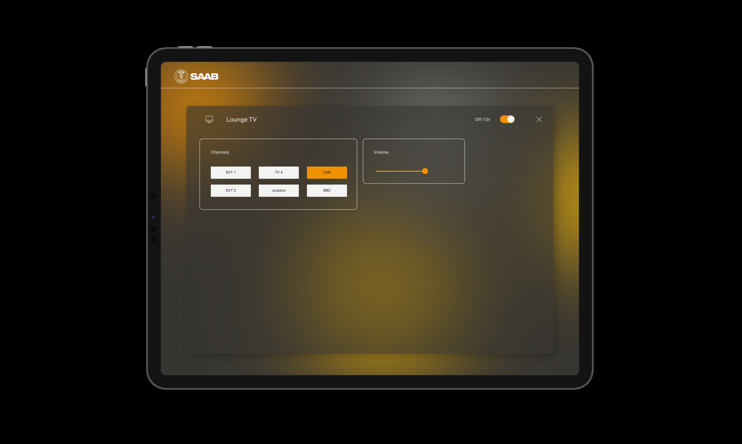
Prototype #2
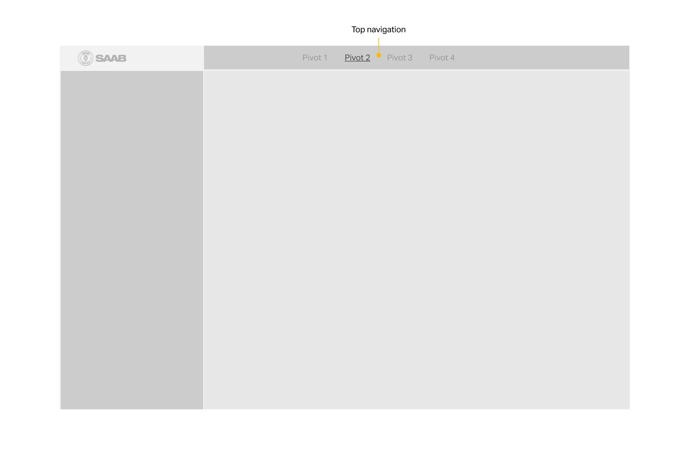
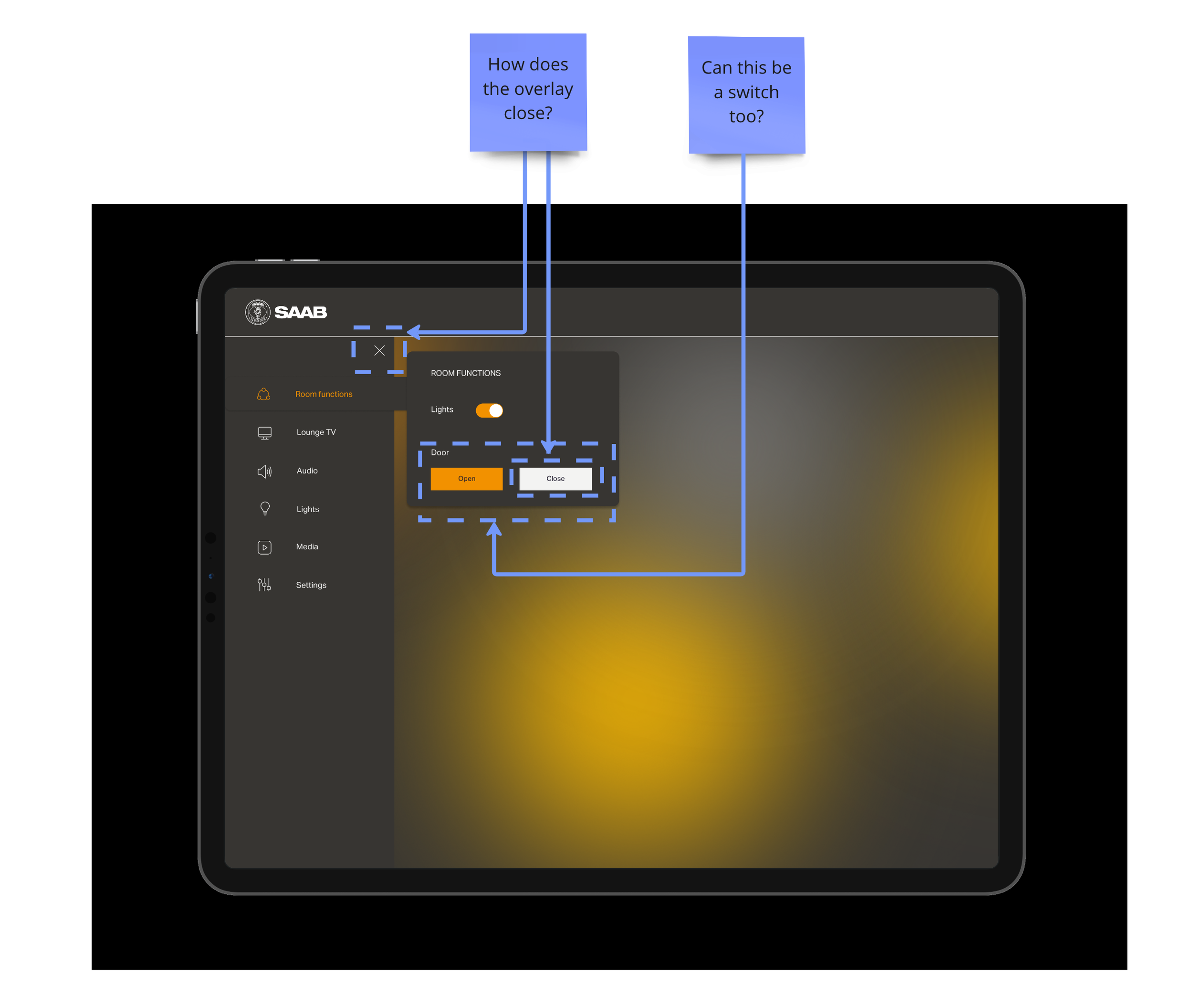
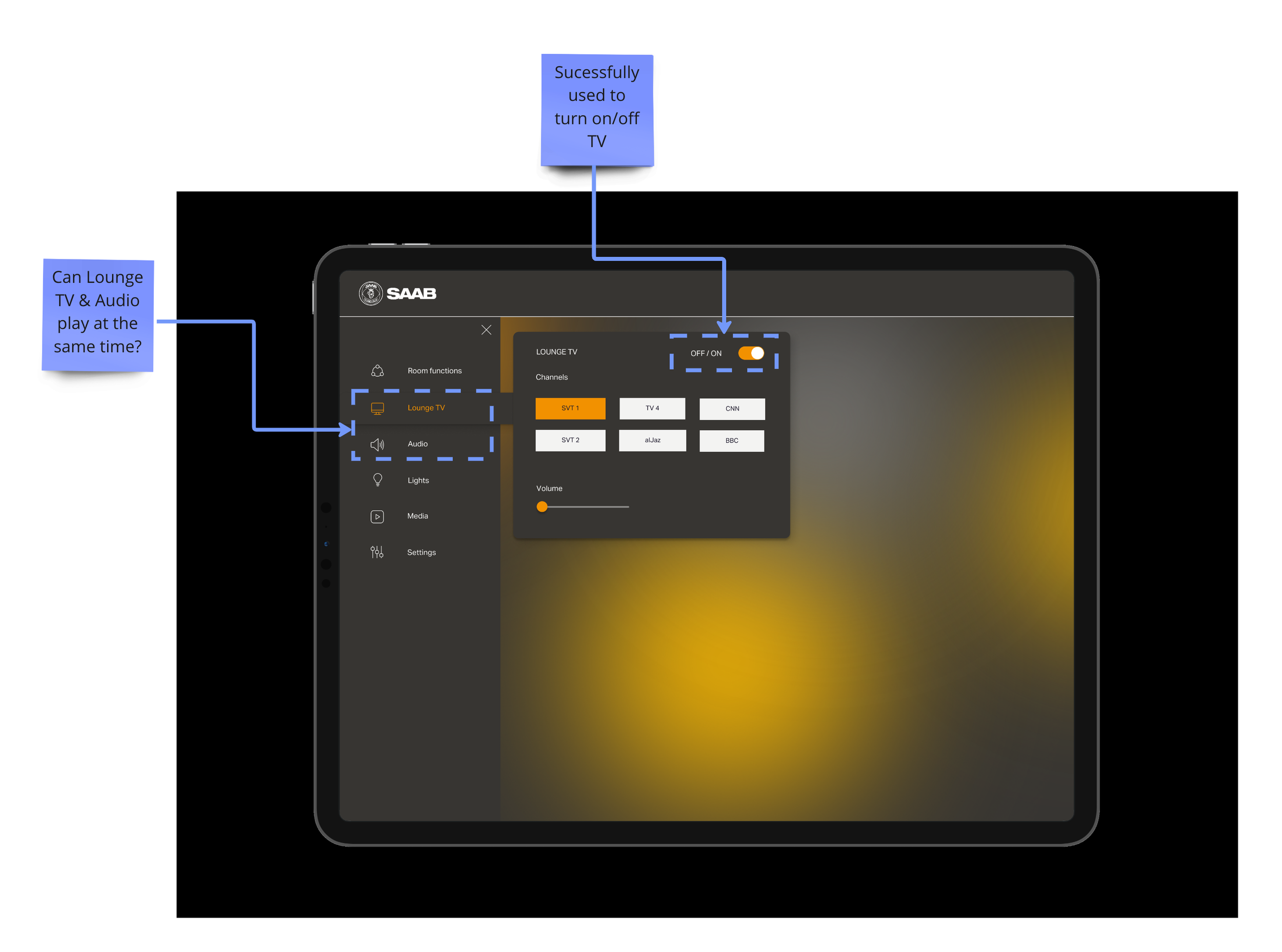
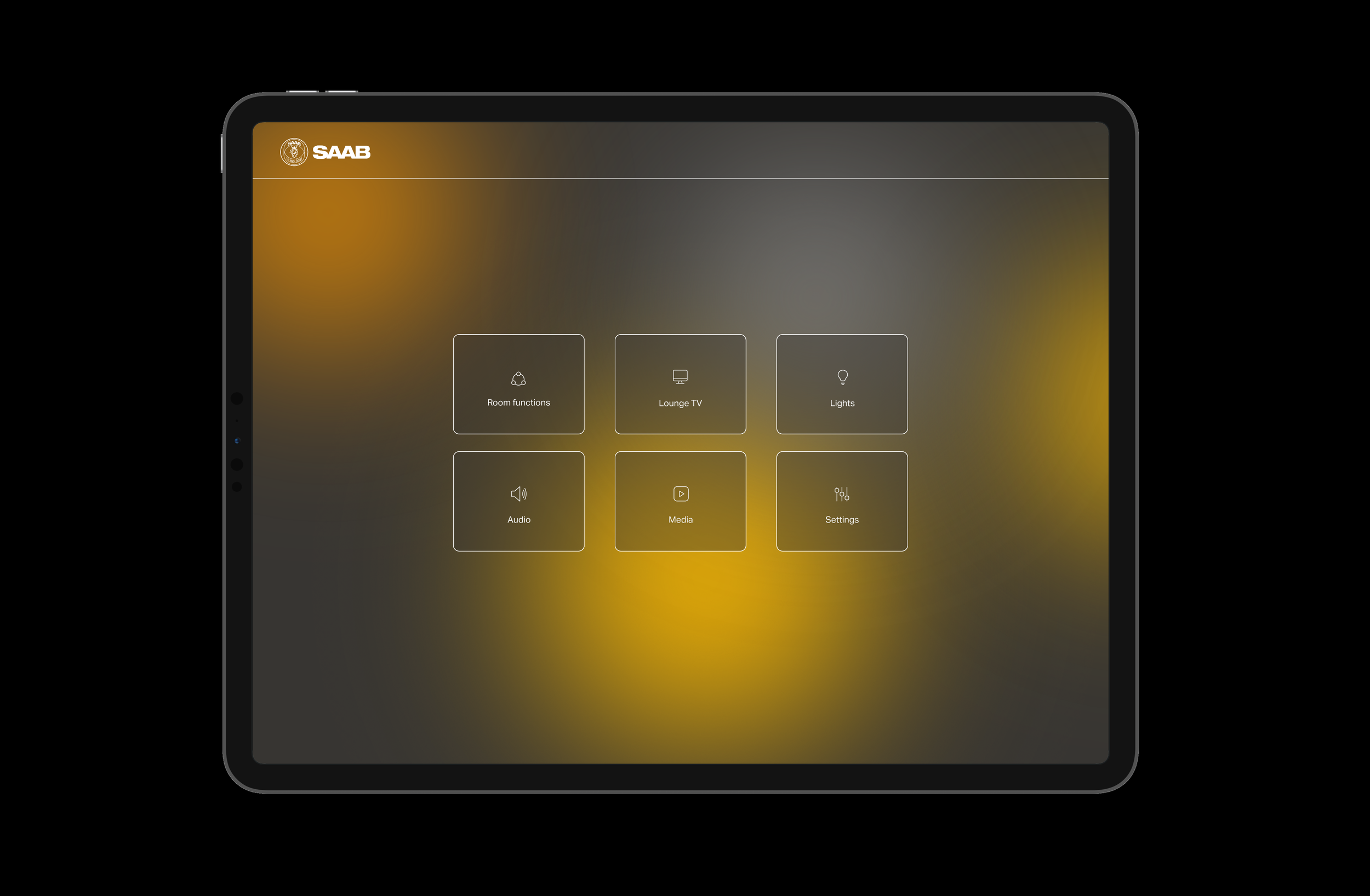
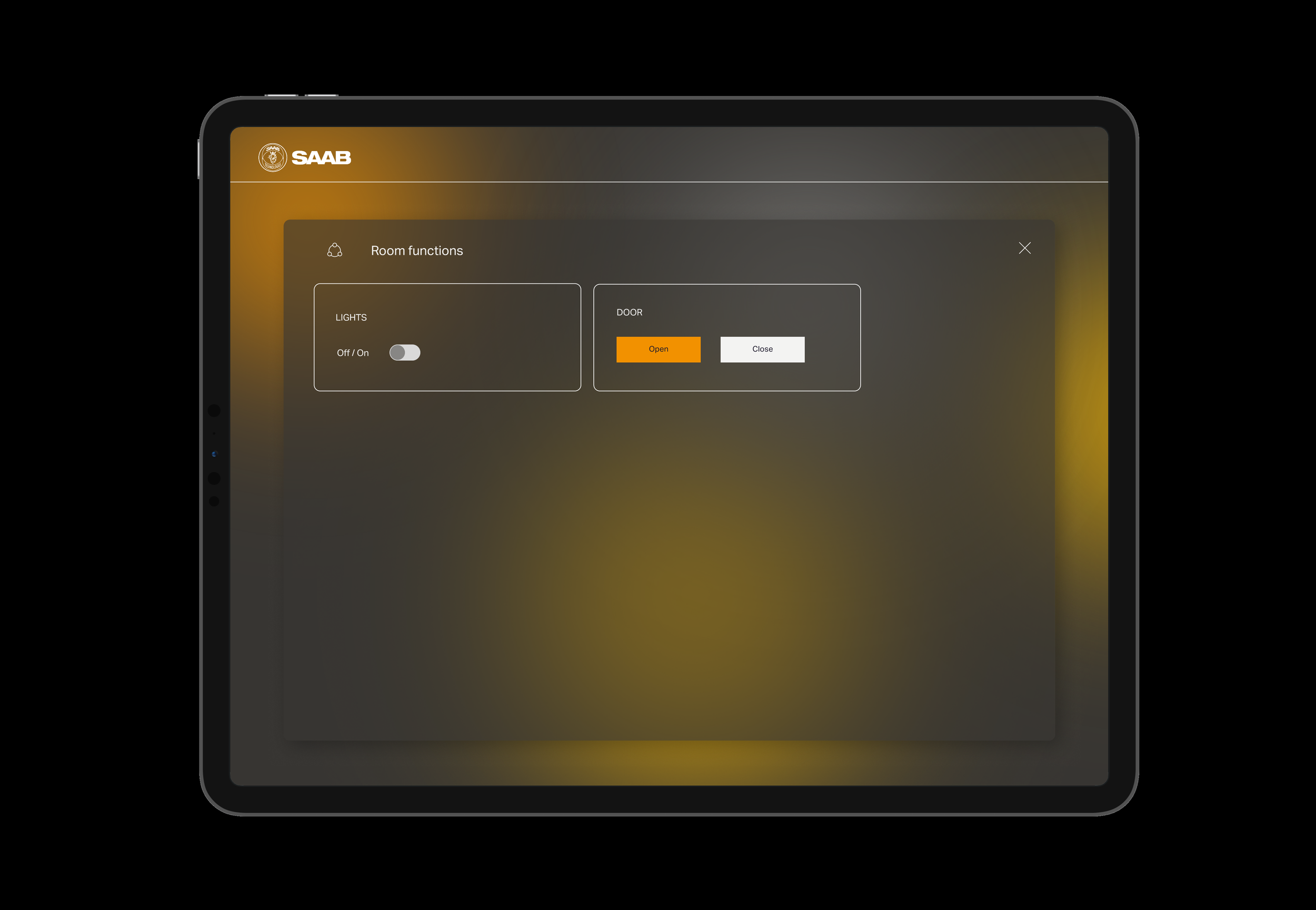
After the usability tests on my first prototype it was evident that I needed to make some changes to the layout. I went back to the drawing board and came up with a new idea for the menu that would eliminate the confusion with the side bar. Instead I crafted a menu with large clickable boxes with options for each function opening in a large overlay.
Usability testing #2
The user tests after the initial prototype manifested some confusion with the menu layout which made me rethink the structure and come up with a simpler solution where your choices instead appear as overlays. This eliminates the need to see the menu at all times thus clearing space and clutter for the user.
Status & learnings
Being able to work in close collaboration with the client and users in an ongoing process has been a key success factor. The close documentation of the process has been helpful as I can show my thoughts and process to the client in an effective way. Showing the process to stakeholders has also proven to be an effective way of funding the project and gaining understanding and approval along the project course.
The next steps will involve Installing the panels in the showroom and evaluating and iterating the design further as we see how they are being interacted with. Then implementing the new design system on all of the technical assets throughout the showroom; such as interactive screens, entrance system & reception desk.
Read more about the project here:
SAAB showroom - Adapt.se